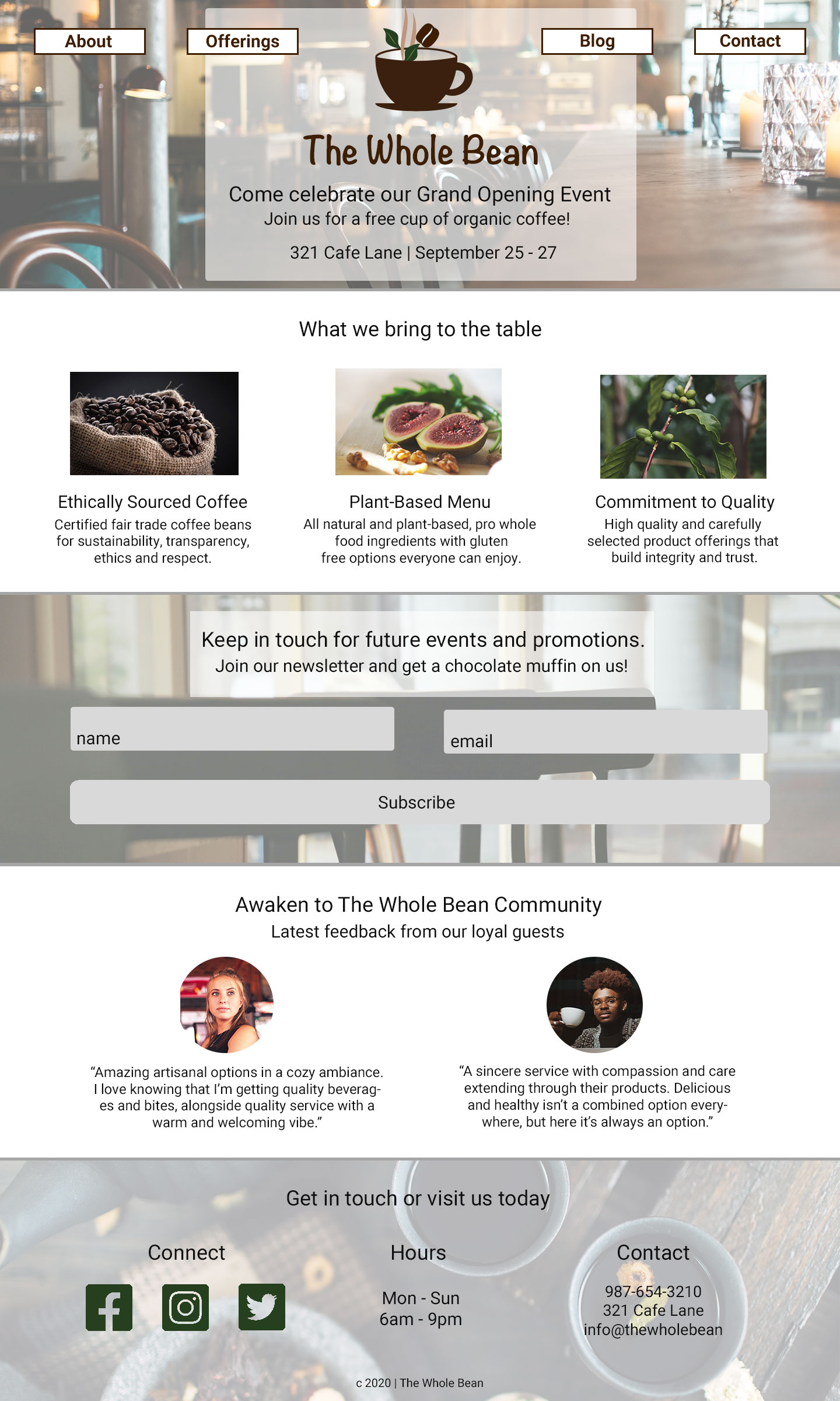
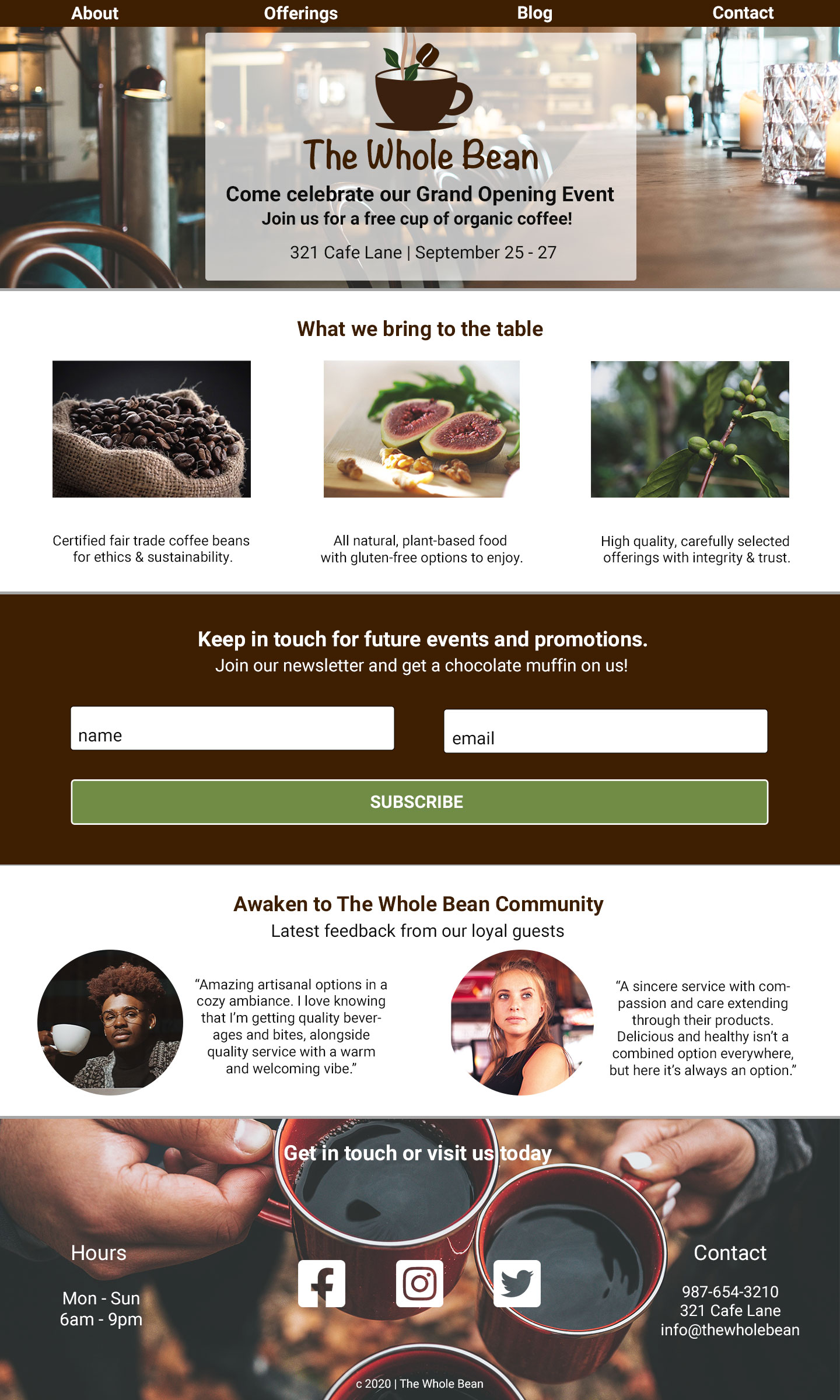
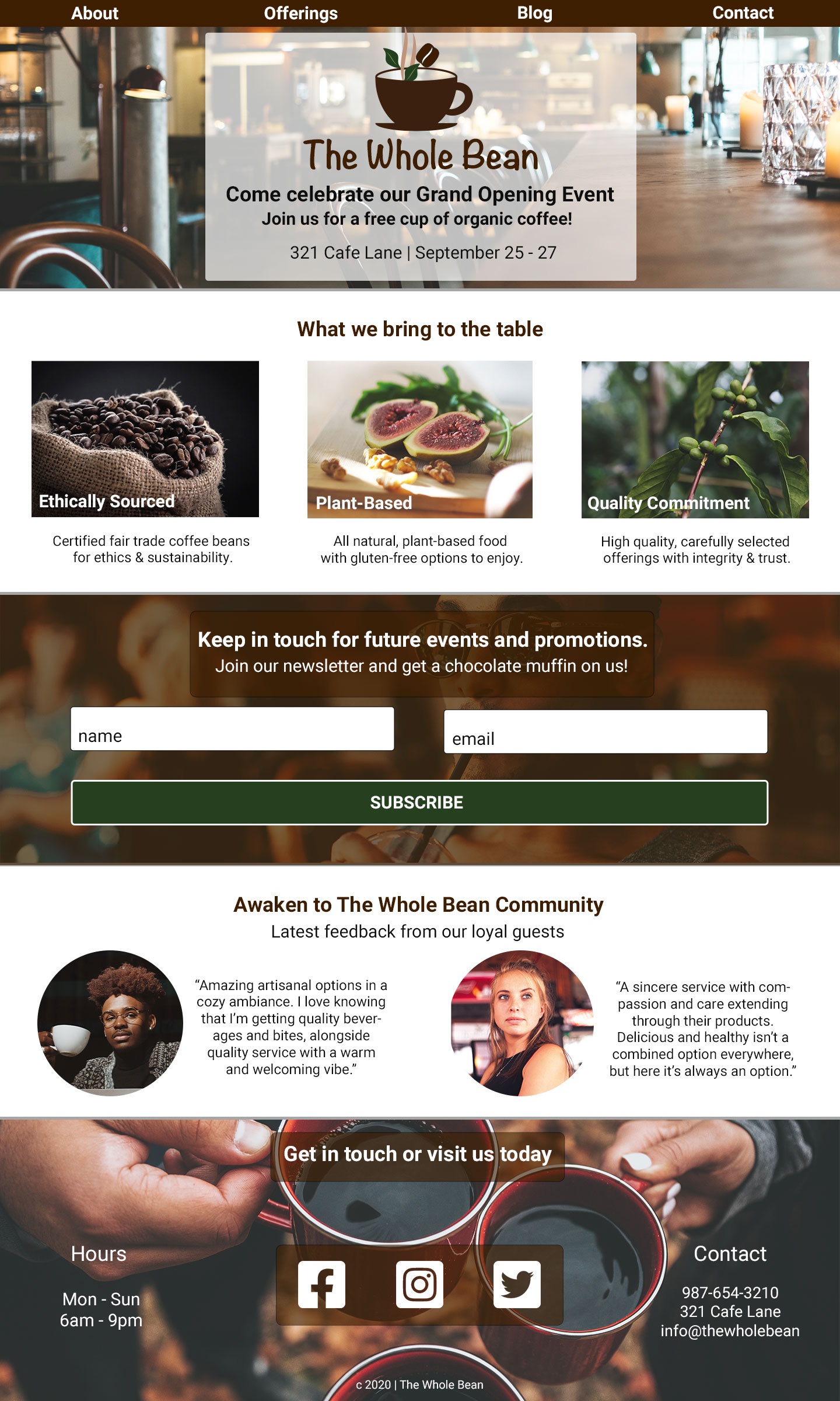
The Whole Bean | Branding, Identity & Visual Design

PART ONE: Branding & Identity Design
Overview
The development of an entire brand & identity package for The Whole Bean coffee shop as they prepare to launch a grand opening. This includes supporting the vision through development of a unique branding personality and designing a complete collection of identity design deliverables.
My Role
Use branding psychology to create a connection through brand personality and related components, building a sense of loyalty among the audience. The identity design deliverables include a typescale, color scheme, collection of brand images, logo, icon pair, social media header and brand style guide.
The Customer
Karla Kahvi has funding and a great location in a popular neighborhood to open a coffee shop. Her strength lies in managing the business and financial side of her shop, but she wanted someone else to take over the design and development of a brand and identity for her coffee shop that fits her products and resonates within the neighborhood.

The Product
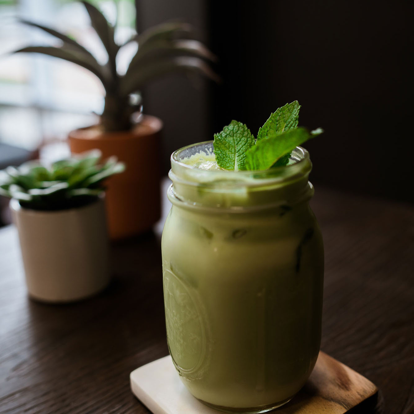
The product line will include coffee drinks (drip coffee and basic espresso drinks), a variety of loose leaf teas, and simple food offerings such as seasonal fresh fruit and baked goods like muffins and scones, as well as quick bites like veggie wraps, sandwiches, and granola bars. The menu is completely plant-based with a focus on whole foods with gluten-free options.
Brand Mission Statement
Declaring the brand's purpose, values, and goals through its mission statement:
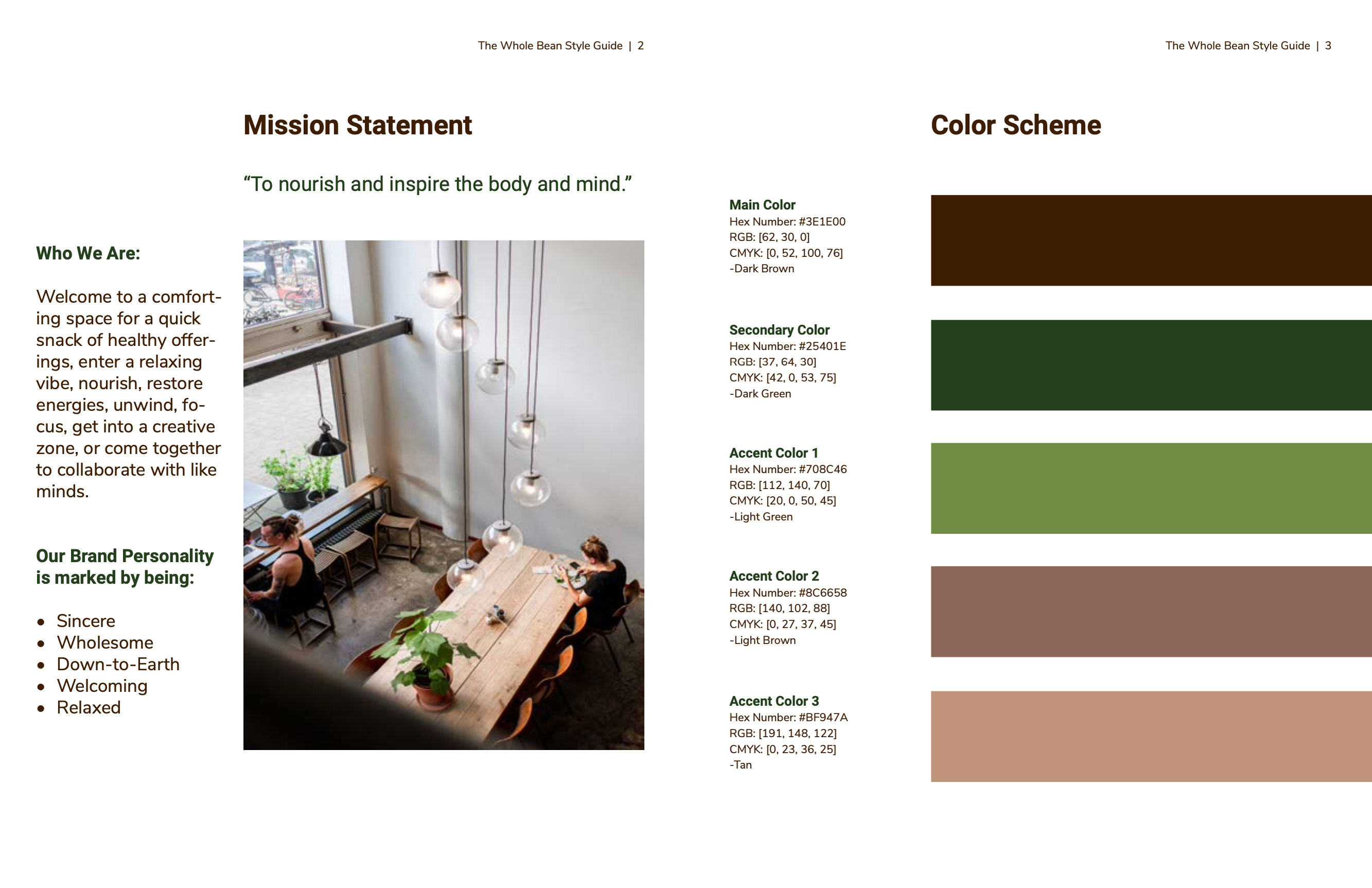
“To nourish and inspire the body and mind.”
Brand Psychology
In order to establish and maintain a connection with an audiences it’s important to understand the psychology behind brand personality, color, typography, pattern recognition and social belonging. Some research into successful brands helps with this understanding of audience expectations and delivering consistently on them.
Brand Personality
Reviewing the 5 personality dimensions of brand personality and their associated traits, The Whole Bean has characteristics that make it clear it falls under the dimension of Sincerity. The brand is sincere, wholesome, down-to-earth, family-oriented, warm, welcoming, peaceful, comforting, healthy and friendly with an artistic edge.
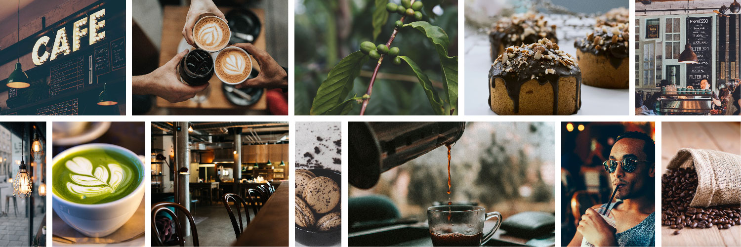
Inspirational Mood Board
Building a Brand
Personality & Identity
A brand's personality and identity are connected on a deep level. The personality includes human traits associated with it and the emotional connection formed with its audience, whereas the brand's identity includes the image and message conveyed, as well as the communicated visuals like logos, colors, and fonts. The key to sending the right message about the brand and the first step toward creating an emotional connection with the audience is to make sure the brand personality, colors, and typography all support each other, make sense, and tell a clear story. Before building the brand personality profile, I developed a couple of target audience profiles for an effective assessment by considering the product and service offerings, and the people most interested in those offerings.
Design Deliverables
- Color Scheme
- Typescale
- Collection of Brand Images
- Mission Statement
- Logo
- Icon Pair
- Social Media Header
- Style Guide
Mission and Creative Brief
Composing a mission statement took some exploring of what exactly The Whole Bean does, understanding the target audience, the reason for the service provided and how to best serve, the purpose for being in the industry, why the business was started, and the desired brand image to convey. From these details the brand purpose was summarized into a simple mission statement: “To nourish and inspire the body and mind.”
The creative brief helped to organize the scope of the project and also acted as a planning tool by describing the goals and purpose, outlining the audience, budget, expectations surrounding deadlines, and to clarify details prior to project work. It included the overall project scope, specific goals and objectives, general client and target audience information, look and feel, strategy, deliverables, and other important details.
Holistic Identity Design
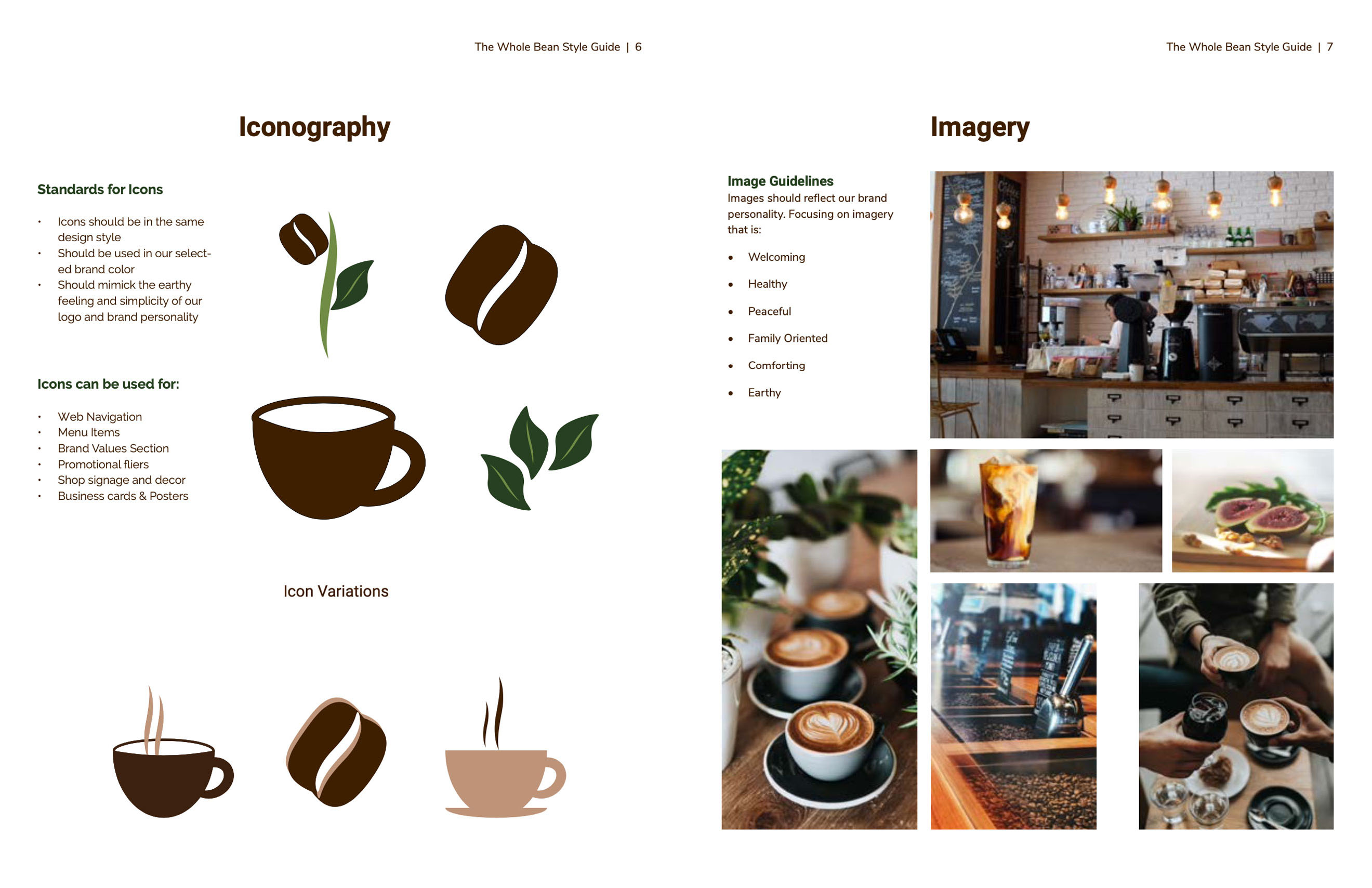
After the preliminary research, planning and structuring the main characteristics of visual branding, it was time to translate the brand’s personality into a clear visual identity consistent across multiple platforms. The holistic set of designs to begin working with next for The Whole Bean’s identity system would include its color scheme, typescale, logo, icons, and imagery.
Color Scheme
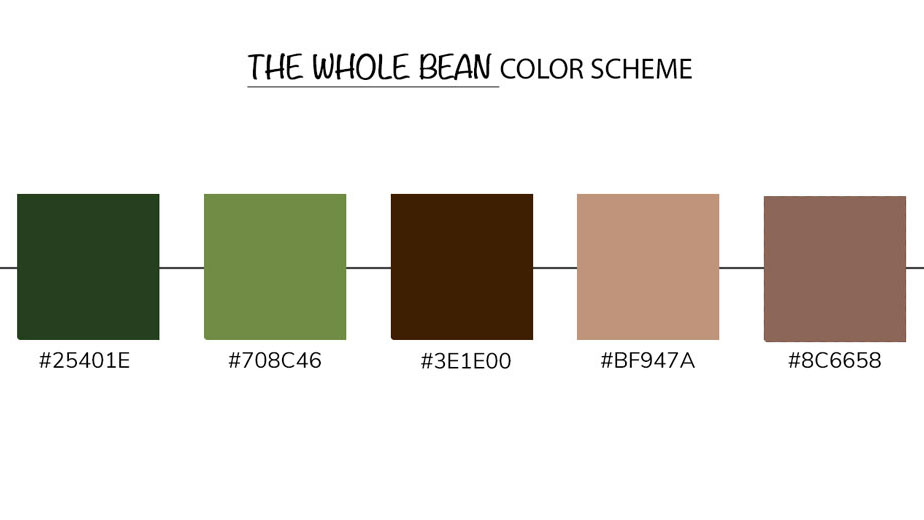
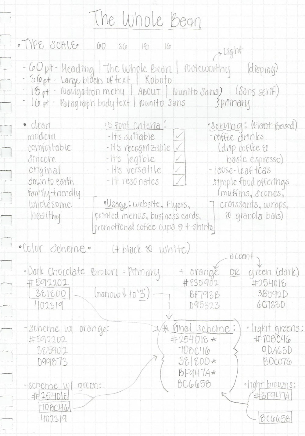
Reviewing general color guidelines and how to stay in touch with audience expectations, I chose to incorporate green into the color scheme with the dark chocolate brown and neutral browns to accent. Green is associated with: peaceful, growth, and health. The deep earth browns complement this and add coffee shop vibes.
Typescale
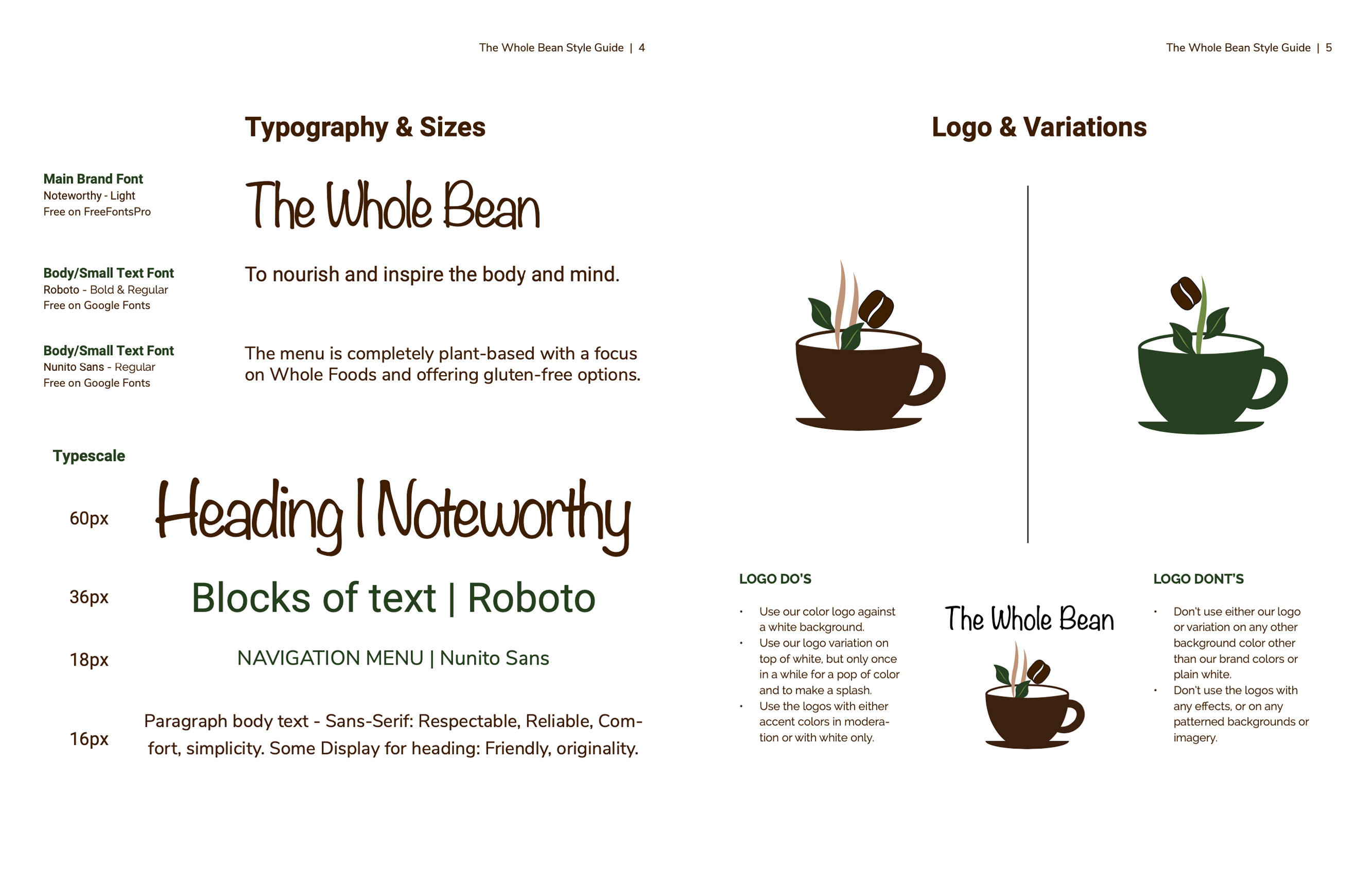
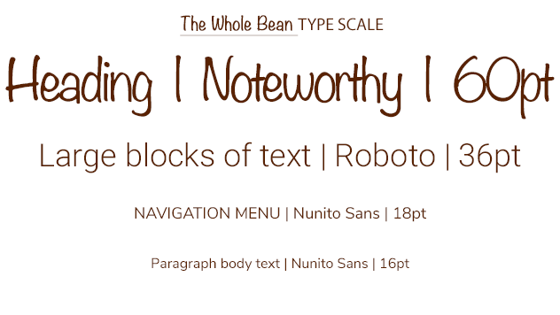
The selected typeface and font family traits to represent the brand need to match the traits of the brand and support the its message. The typeface chosen is mostly sans serif with clean edges, modern style, and stability, that works with an interesting display font that exudes friendliness and uniqueness.
Logo & Icon Design
An effective logo needs to blend seamlessly into a holistic identity system. Features of effective logos include simplicity, being memorable, and versatility across platforms. A logo should capture attention, engage the audience, and even create customer loyalty.
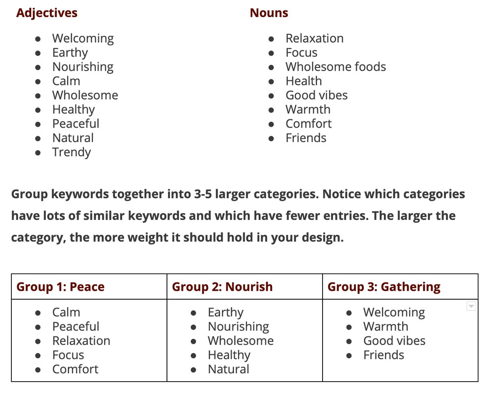
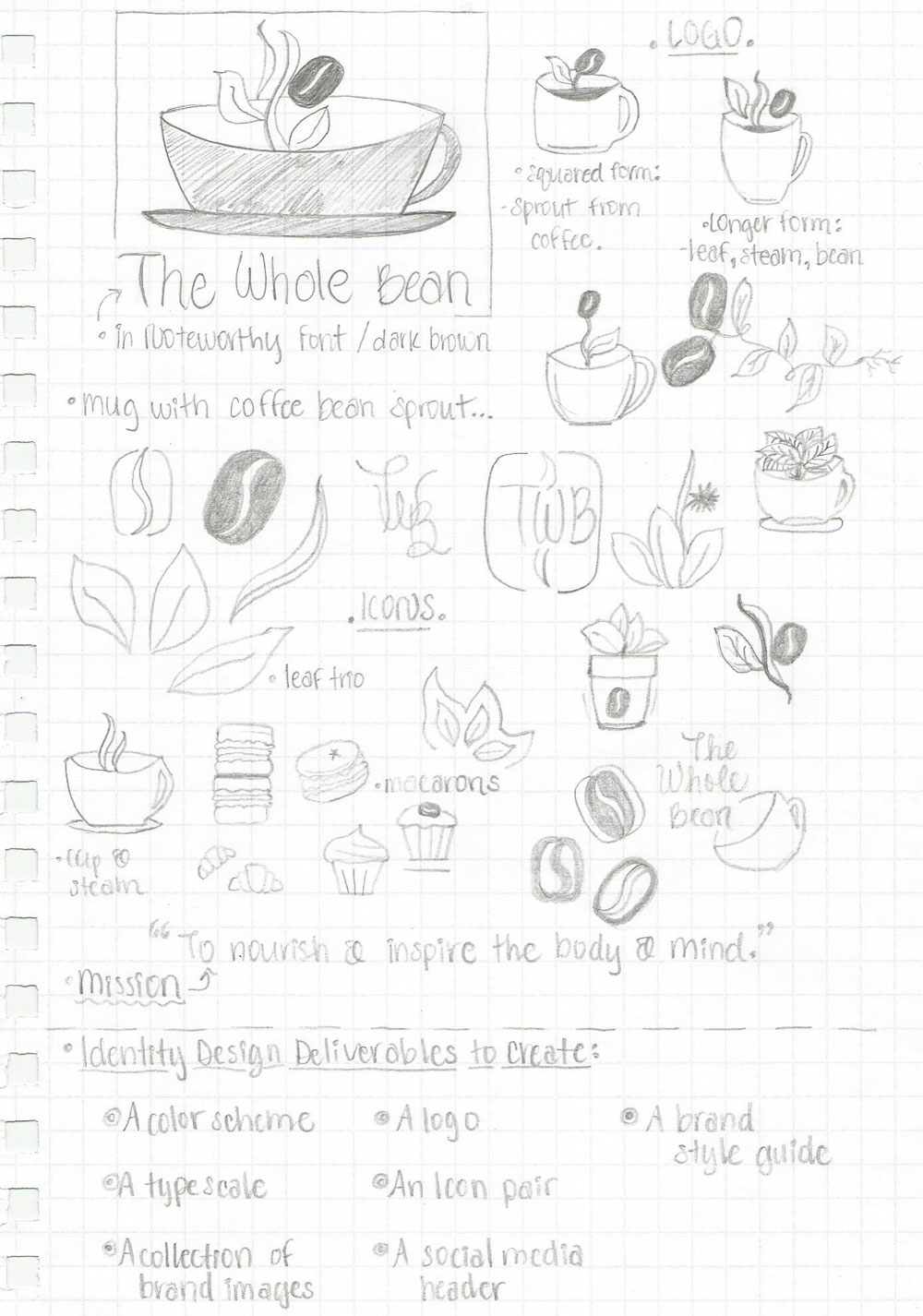
I began design of the logo by brainstorming keywords for the brand personality, grouping them into categories, viewing representative images, and then hand drawing some rough sketches for the logo concept. Finally, I cleaned up my logo sketches into some final variations to begin digital logo design.
Visual Messaging
Designs likes graphics, icons, or images can communicate ideas, messages, and feelings through their visual elements. This visual messaging of ideas can create a stronger emotional connection with the audience, giving the brand more credibility by making it seem recognizable and inspiring feelings of trust.

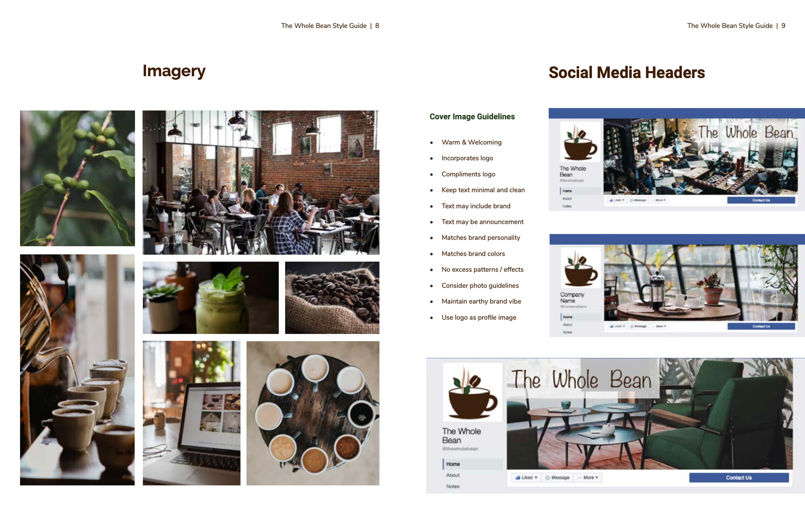
The imagery should evoke vibes consistent with the brand aspects: friendly, peaceful, healthy, welcoming, convey comfort. The tone of voice should support adjacent content: sincere, kind, healthy, warm. For the audience response I want to build trust and loyalty, for them to feel welcome, comfortable, safe, healthy, alive, nourished, and embraced by compassion. The composition should be clear and Images should complement the brand's logo, color scheme, and typography.
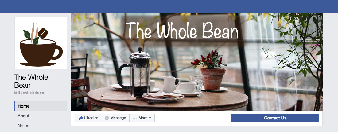
Social media interaction provides a huge opportunity for building brand recognition and connecting with the target audience, as well as building trust. The social media headers designed also need to match the brand's personality, keeping in mind the look and feel.
Completion of Style Guide
The Whole Bean is a cozy coffee shop with mellow vibes in a harmonious community neighborhood. The holistic set of identity designs created echo the the brand’s personality and compose the brand’s identity system of representative elements. Everything from its mission, to color scheme, to logo should deliver a consistent message and work together seamlessly with the brand’s image and voice.
View the full brand style guide: The Whole Bean pdf
