Travel Adventure | React JS Development
Overview
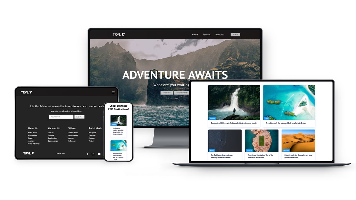
A React JS website built from scratch using mainly React Hooks and React Router. The website is fully responsive across screen sizes with an attractive dark theme, reusable card components, and can easily be customized with animated background for header and throughout the interface.
Features
- Efficient and pleasant User Interface
- Reusable components throughout code
- Hover and animation effects, card links
- Responsive format on different devices
Development & Design
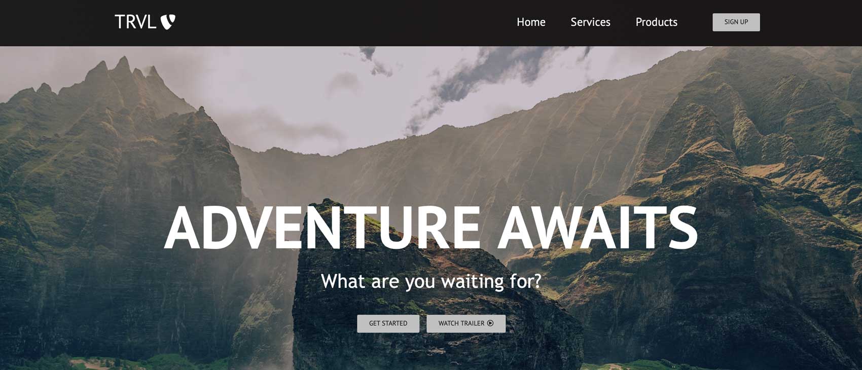
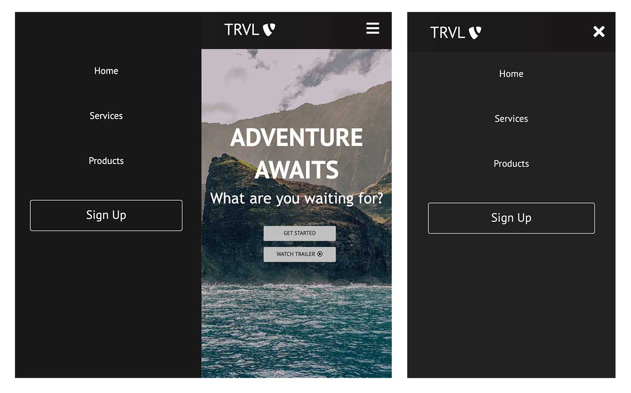
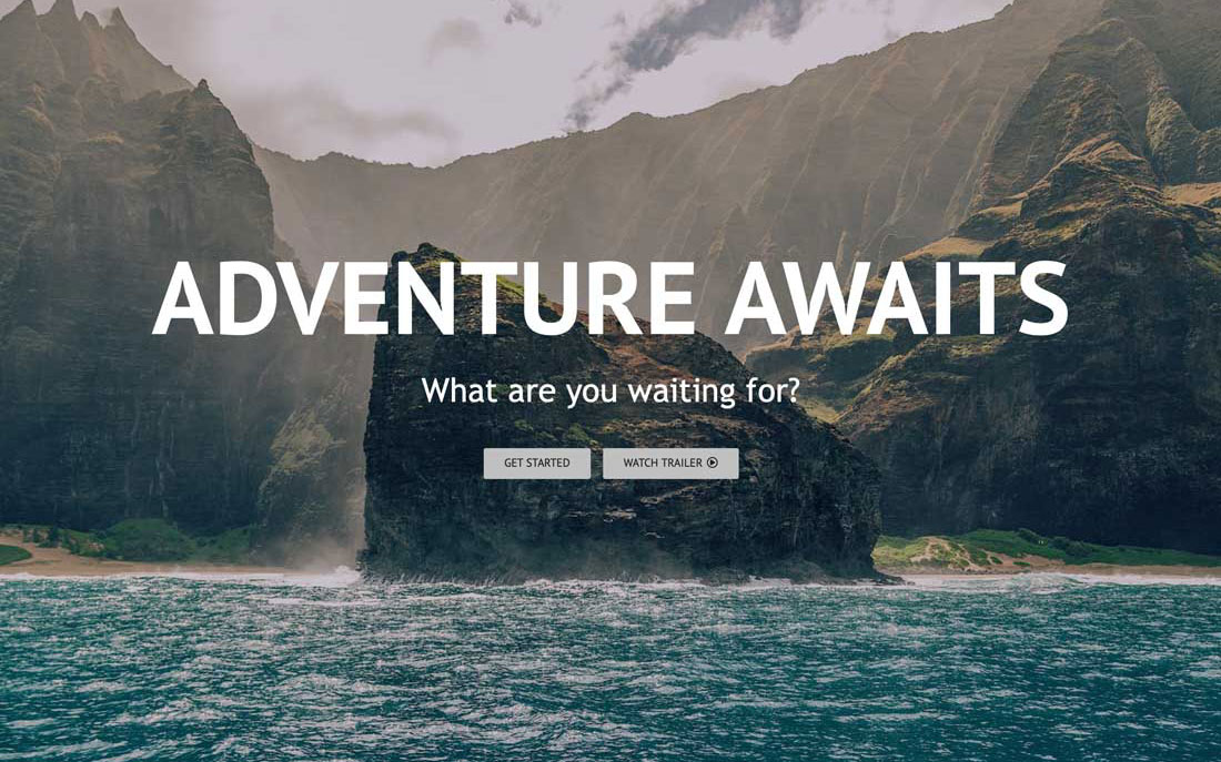
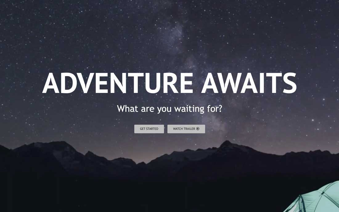
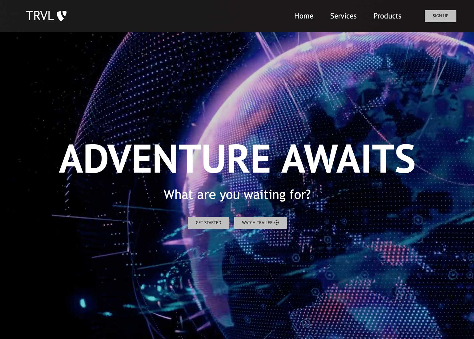
Once the React files were initialized, the code debugged and set up for the project with necessary imports, React Router navigational components were implemented. From there, development and design of the UI followed. Navbar and button components were developed and styled with a mobile responsive hamburger menu that opens and closes with clean and easy to use navigation links. Some changeable options for the Hero container background include a static image of natural wilderness accessed via CSS or an exciting animated, adventurous video clip within the JS functionality.
Mobile Navbar & Background
Pages & Card Components
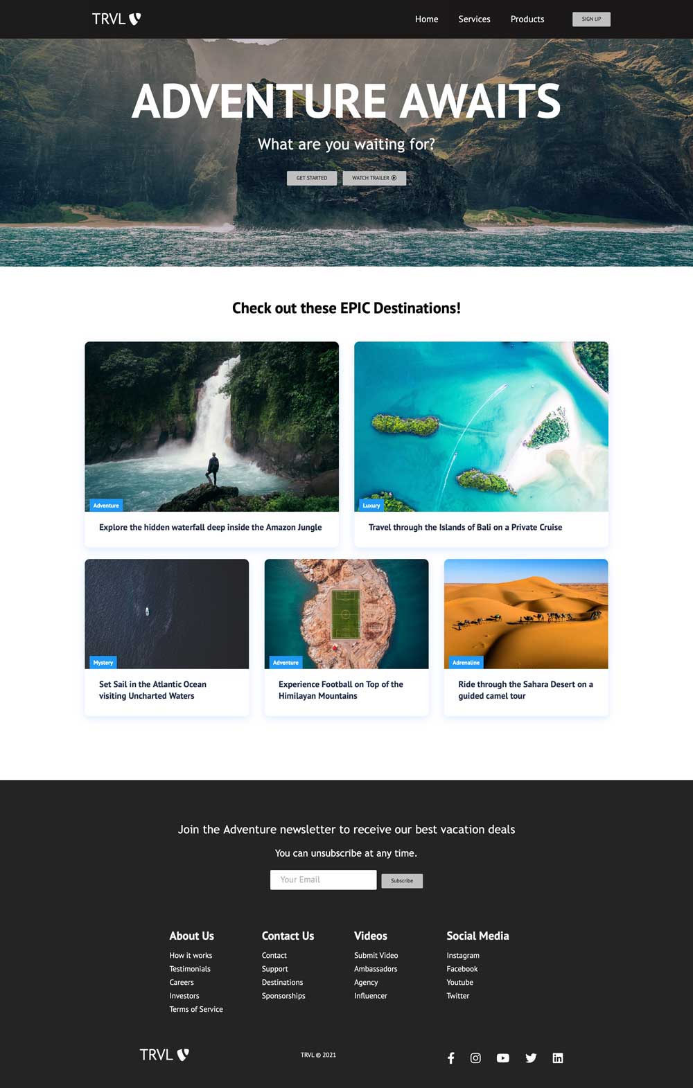
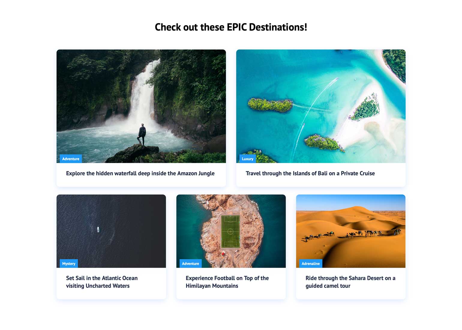
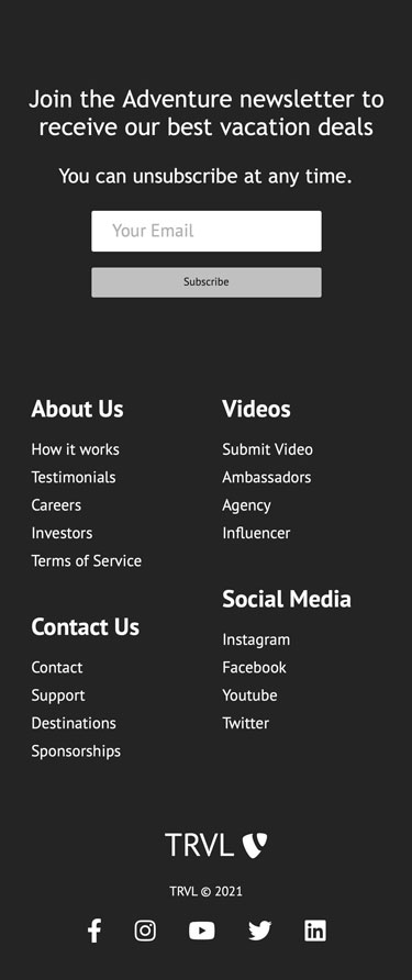
With the navigation bar working across screens, the hero section background in place, and the functional button components looking good, next came the creation of the pages and the card components for them. The reusable card components have a magnifying effect upon hover and can be placed into rows of two or more, as desired and depending upon the total number per page or prioritization of sizing for each. For the home page desktop version we have a row of two cards, and then a row of three cards. These cards responsify and condense down by stacking on top of each other to accommodate smaller screen sizes.
Footer & Finalization
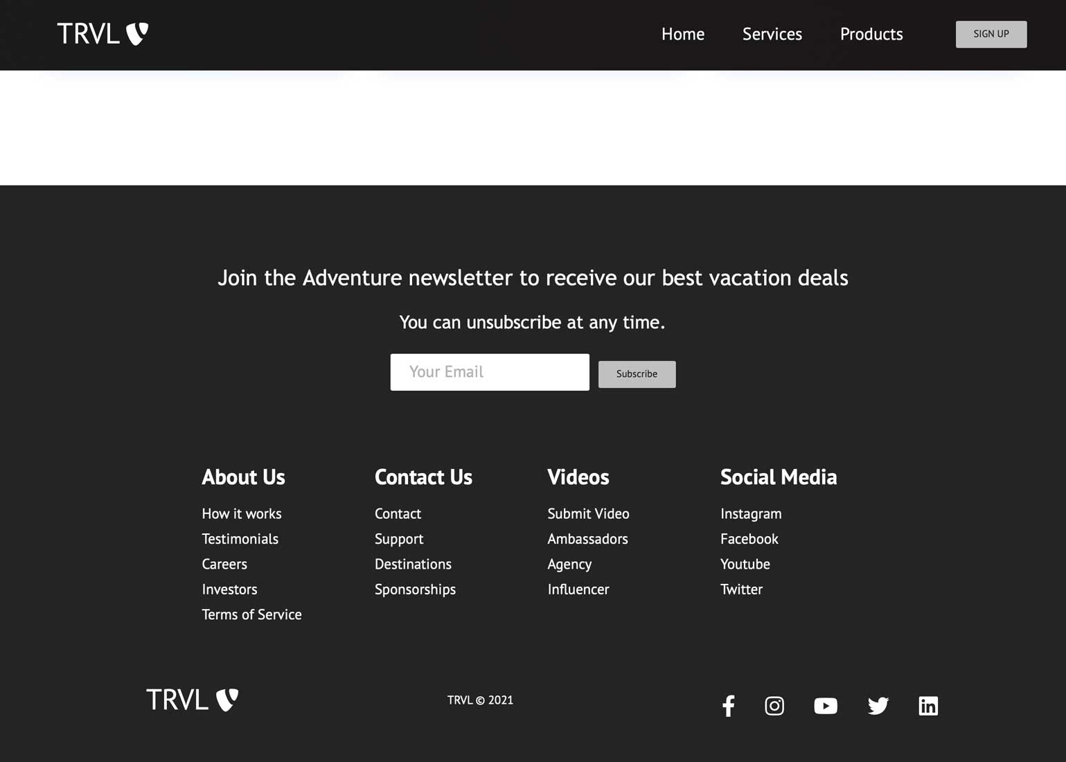
This project was wrapped up with the beautiful footer component, offering various links and resources for more information. At the top of the footer is the call to action which contains a basic subscription form element with email field and button. Following the CTA are columnized lists with secondary links for assistance and services. Lastly is the logo with home page link, copyright and traditional social media icons with associated links.
Finished Homepage
