Earth Hour | Digital & UI Design
Overview
Creation of a modern microsite for a great cause and an important environmental movement. Requirement was to create an informative, engaging and professional looking digital platform for Earth Hour; an annual environmental movement. The UI design must be modern and eye-catching but simple for a quick yet effective message delivery.
My Role
- Design a simple brand and theme UI.
- Identify and prioritize site content.
- Create an eye-catching single page site.
- Separate each section of navigation.
- Create a clear & influential user journey.
Deliverables Required
- One full microsite design
- Style tile with color and type
- 800x600px mockup to present design
Timescale and Deadline
1.5 days to complete. This gave me enough time to gather inspiration and imagery, and then focus on developing my theme. With limited time I had to be disciplined with the ideas I was creating and be selective with exploration, keeping things simple and sticking to the main message.
Introduction & Mission
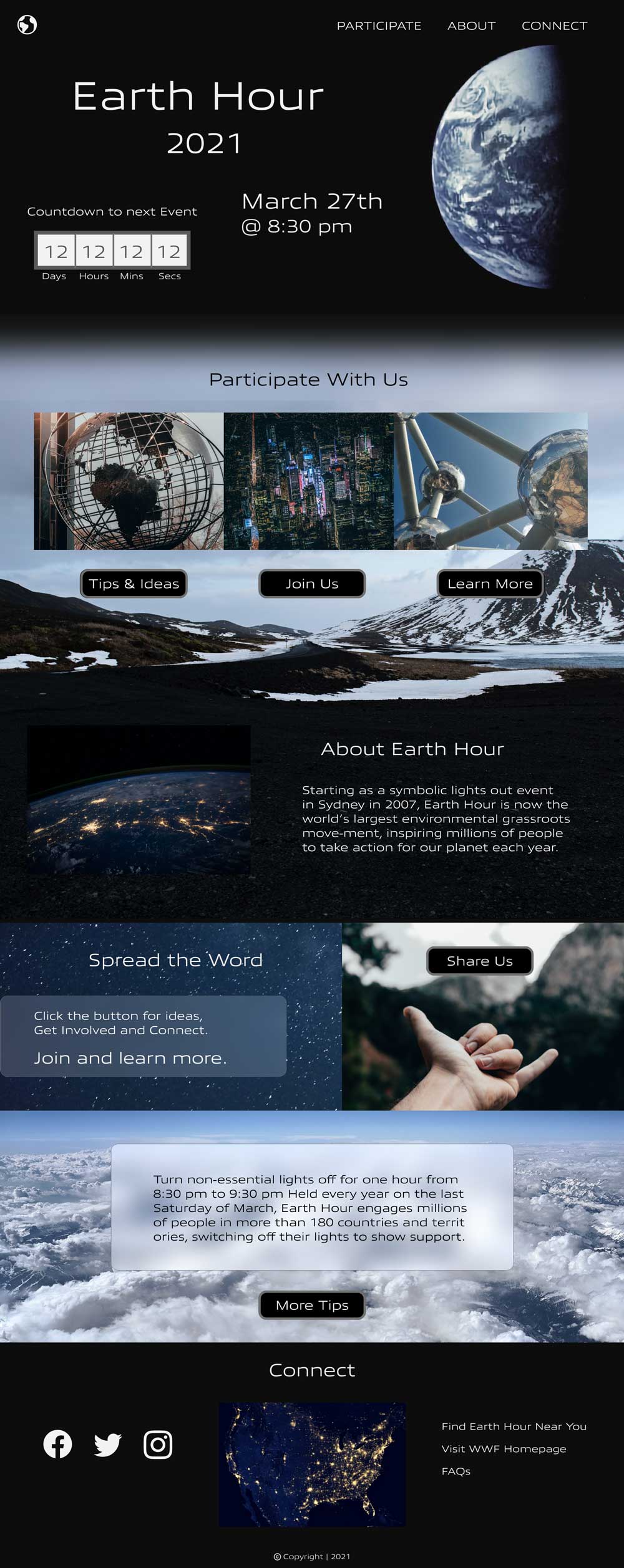
Earth Hour began as a symbolic lights out event in Sydney, Australia in 2007, and soon became one of the world’s largest environmental grassroots movements. Now, every year millions of people are inspired to take positive action for our planet.

About Earth Hour
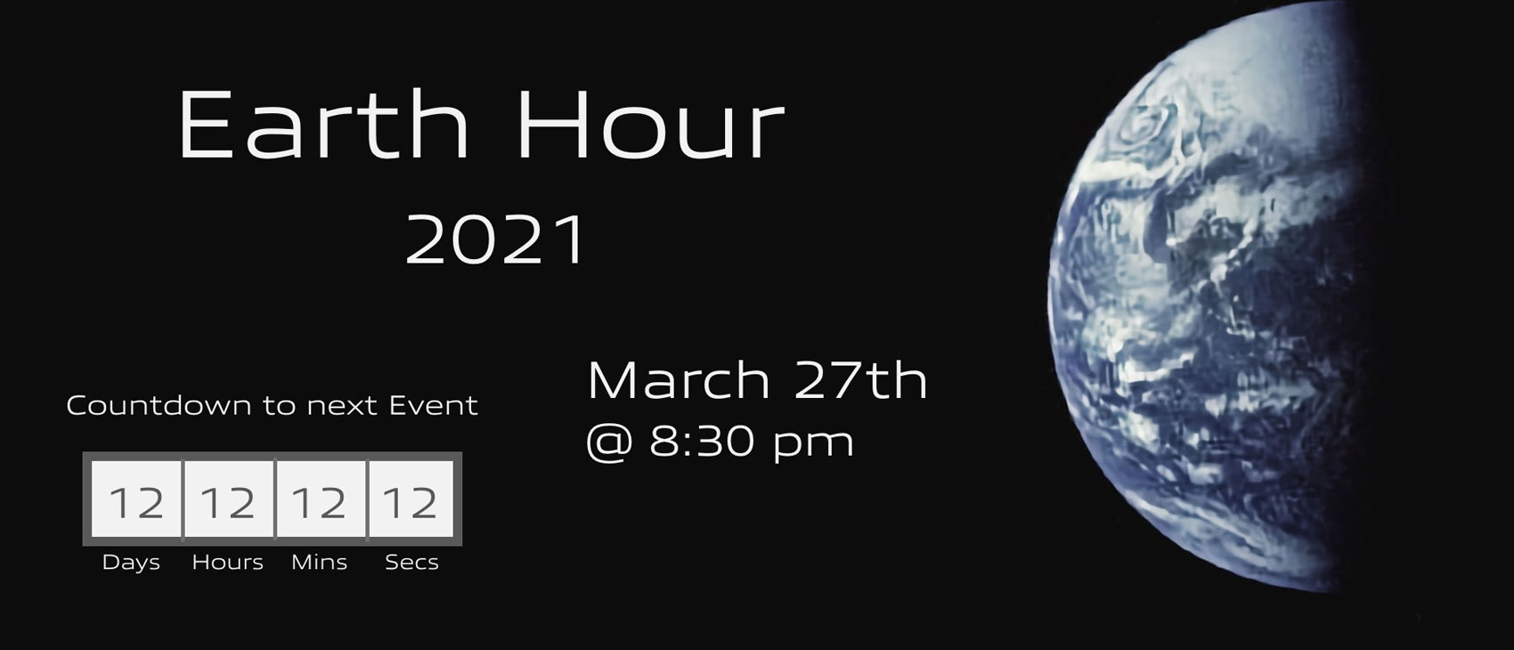
People from all around the world have joined this movement to take part in Earth Hour. They do a wide range of activities over the hour to show reverence for our planet’s future. Many choose to be a part of Earth Hour simply by turning their lights out for one hour from 8.30pm – 9:30pm local time, as a symbolic show of solidarity for the planet.
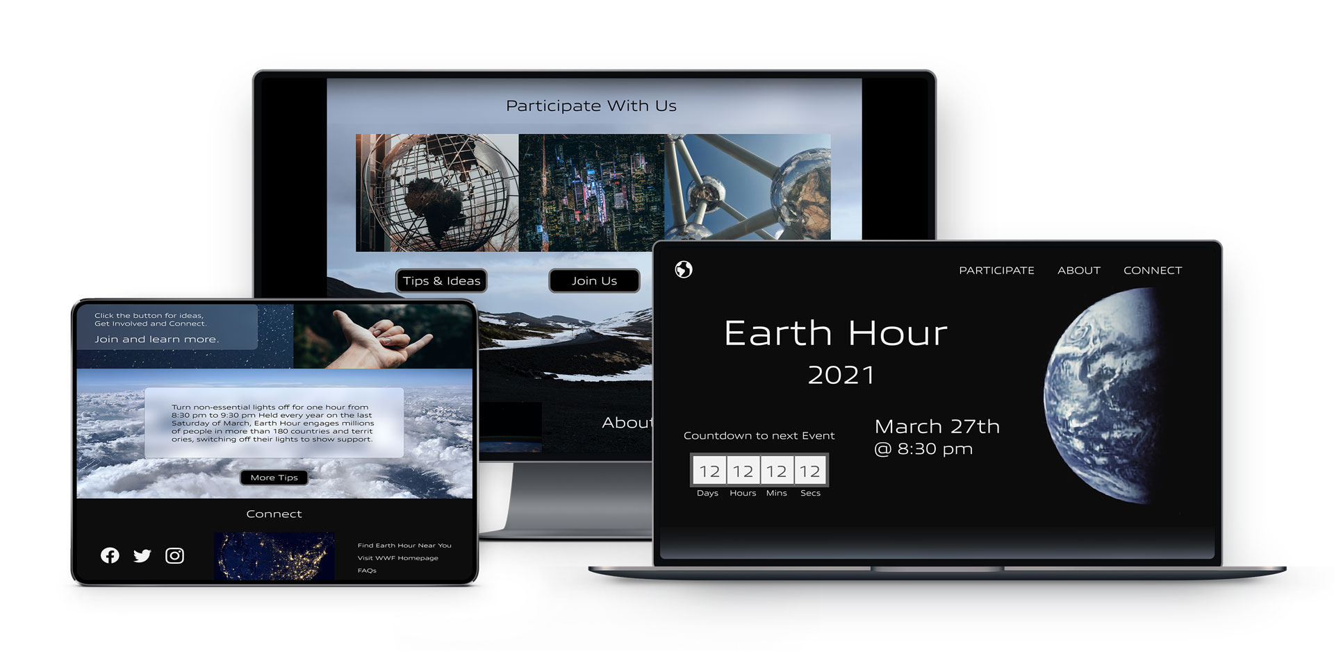
To spread the word of this great environmental movement, and to encourage people to get involved, an Earth Hour microsite was designed. A microsite is basically a small, often one page, website which functions as a supplement to a primary website. In this case, the idea is for the microsite to be housed on the main WWF website.
Inspiration
Alongside the process of gathering imagery into a mood board, I was reminded of a beautiful and thoughtful poem I had come across previously. I felt the following poem echoed the message and was suitable for the event, and so I really wanted to share it somehow along with the design as its own inspirational art form in compelling words.
Keeping Quiet
Now we will count to twelve
and we will all keep still.
For once on the face of the earth
let’s not speak in any language,
let’s stop for one second,
and not move our arms so much.
It would be an exotic moment
without rush, without engines,
we would all be together
in a sudden strangeness.
Fishermen in the cold sea
would not harm whales
and the man gathering salt
would look at his hurt hands.
Those who prepare green wars,
wars with gas, wars with fire,
victory with no survivors,
would put on clean clothes
and walk about with their brothers
in the shade, doing nothing.
What I want should not be confused
with total inactivity.
Life is what it is about;
I want no truck with death.
If we were not so single-minded
about keeping our lives moving,
and for once could do nothing,
perhaps a huge silence
might interrupt this sadness
of never understanding ourselves
and of threatening ourselves with death.
Perhaps the earth can teach us
as when everything seems dead
and later proves to be alive.
Now I’ll count up to twelve
and you keep quiet and I will go.
Poem by Pablo Neruda
Translated to English by Alastair Reid
From Extravagaria : A Bilingual Edition
Noonday Press; Bilingual edition (January 2001)
Inspirational Poetry
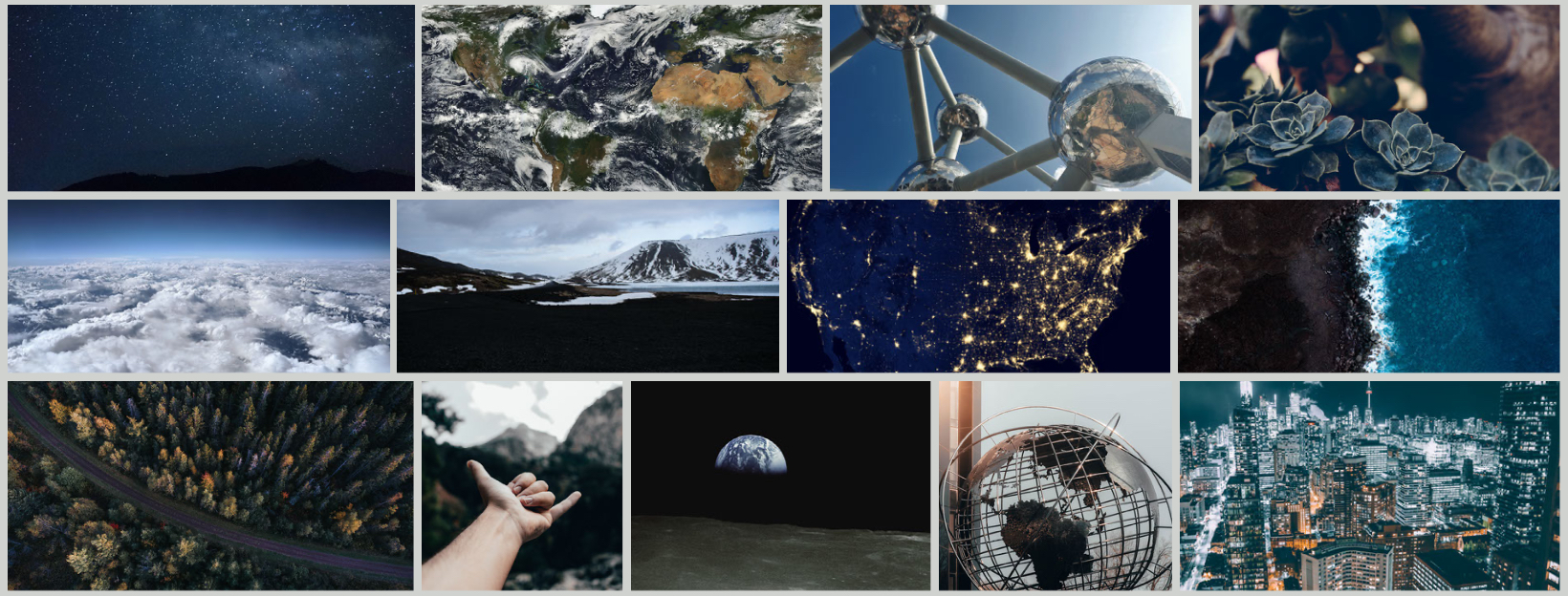
Inspirational Mood Board
Design Elements
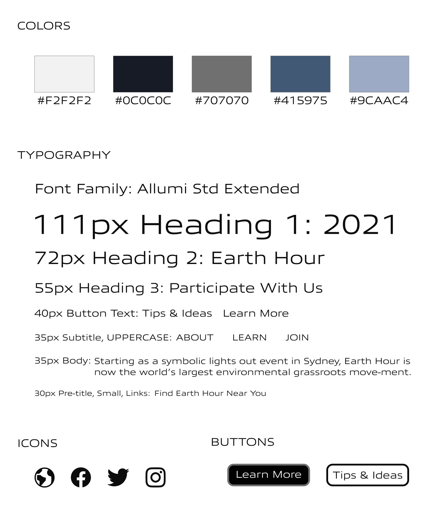
Color Scheme
For the color scheme I wanted an earth blue hue with nearly black and white. I liked the idea of a dark theme for the ‘lights out’ aspect and to reflect the nighttime. I also decided to incorporate plenty of contrast, which I used to help separate the navigational sections. Once I had colors in mind and some imagery inspiration, I eyedropped colors from the images.
Typography
The typeface I selected had a unique, digital edginess to it, but still had some smooth lines and was clean and reader friendly enough to work with paragraph text. After playing with a few options, I settled on fonts from a single typeface that I liked across the site, including extra large and various sized headings, capitalized for navigations, and smaller button text.
Buttons
I experimented with different sized buttons, the font size within, and then the actual color. The final design has default black button backgrounds, with the active state in white.
Finishing Touches
The visual contrast assisted in catching attention and I incorporated some other-worldly images, bringing the user’s attention to the movement and theme ideas. Since the request was for a micro site and with a strict timeframe, and also to keep things clean and the message clear, I limited the displayed information on the page and provided call to action linked buttons for the users to visit different sections of the the main WWF’s website further to get ideas and tips, explore their social media pages, share the event with others, and to access more information on the movement. This would also help the organization to receive more traffic from interested visitors and potentially allow them to discover other areas of concern and even to visit relevant partners or causes, amplifying the mission.
Microsite Webpage