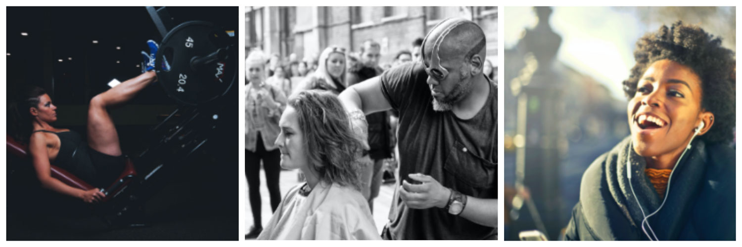
Dorothy Delong | UI & Website Design
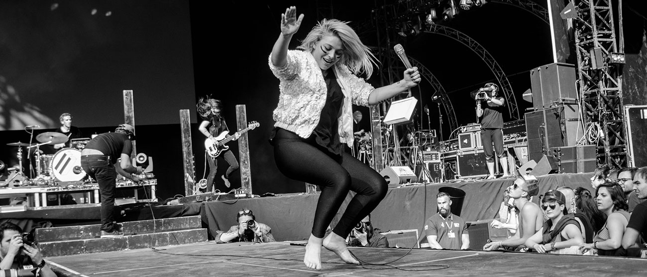
Overview
A project where I used web design fundamentals and design work flow to plan and design an original, single-page web design project from concept to creation. I incorporated research and UI design skills to create, finalize, package and export a comprehensive final digital design comp.
My Role
- Utilize a Web Design Workflow to research, conceptualize & design.
- Identify and prioritize site content + structure, layout & placement.
- Build a functional, visually pleasing & user-friendly site structure.
- Hand-pick cohesive colors, typography and visual design elements.
- Mobile first approach. Gather, assess and implement feedback.
The Customer
Dorothy DeLong- a traveling feminist photographer who explores the country in search of women doing amazing things. Dorothy captures their boldness in action, whether protesting for pay equality, fighting for environmental regulation, or standing up for those in the #MeToo movement.
- Quote about Dorothy's mission: “I capture the realness behind feminism, no filter.”
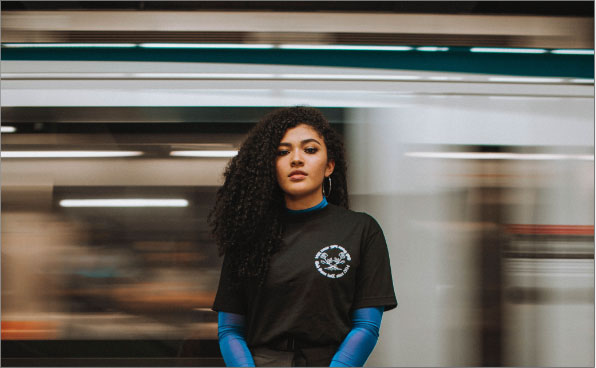
The Problem
Dorothy has been using a Facebook page to share all her photos but now she’s ready for an upgraded, professional online presence. Up to now, she has had to put together a physical portfolio for museums interested in her work. Dorothy wants a portfolio website to display her work so that galleries and magazines can see her photography at a glance and request to use it.
Web Design Workflow
I used the following workflow framework for efficiency:
- Step 1. Gather information
- Step 2. Organize and sketch site structure
- Step 3. Add detail to the design
- Step 4. Create a final design comp
- Step 5. Feedback and iteration
- Step 6. Prepare files for next steps
Research & Planning
The first step was gathering information in order to get to know the client, understand the main goals of the site, her style, needs, and any parameters to keep in mind for the design.
After an introduction to Dorothy and her goals, I sought out inspiration to encourage the creative process. I compiled an inspirational mood board, browsed related sites, and took a moment to reflect on the project. Gathering one’s thoughts, feelings, and intentions at the start of a project is useful for maintaining scope and providing guidance along the way.
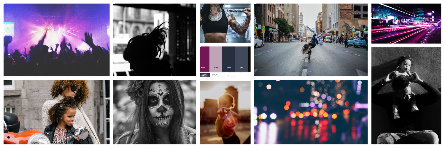
Inspirational Mood Board
Gathering Information
Dorothy’s Goals
- The website should entice magazines to purchase her photos for publication. She wants a good place to showcase her work when magazines ask for a portfolio.
- It should help get her work shown in museums, both locally and abroad. A great portfolio site would allow her work to be shown much more widely.
Dorothy’s Parameters
- The site should be one page since she doesn’t want a ton of content to update.
- The site must include:
- An artist’s statement, which will help visitors of the site learn more about Dorothy
- A photo or headshot of Dorothy
- A quote about her mission
- Site navigation that will link to each content section
- Her logo and full name
- Four samples of her photography work - she wants to start small and potentially add more at a later date
- Contact information
- Social media links
Conducting Research
I reviewed her goals and parameters and assessed her responses to a project intake questionnaire:
- Who are you trying to reach with this website?
- Who are your competitors?
- What are some website designs that inspire you?
- Can I see some of your work samples?
- Do you have a logo, specific colors, or any other content I should include on the site?
The responses provided me with helpful information on her target audience- usually magazines that want to use her work in editorials and galleries that want to show her work. She wanted to make it really easy for both of these people to find what they need from her site. Her competitors include others in the same niche of photography, exhibiting artistic feminism and bold street shots.
I was able to see some design examples of what she liked and discovered she was very inspired by Bettye Lane’s work as a photographer, and looked up to her as a role model. I also viewed several samples of Dorothy’s own work. Her style varies from street and candid shots to more staged ones and her photos tend to center around either feminism in action or feminism in moments. I was provided with photography samples and her personal logo.

Artist's Statement
“My work focuses on candid photographs taken on location at events for women’s rights, places where women are owning their space, and fleeting encounters on the streets. My work engulfs the viewer in real moments of strength, vulnerability, and solidarity.”
Organization of Site Structure
Structure, Layout & Navigation
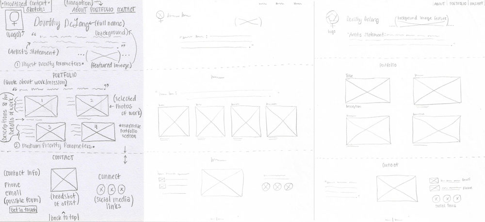
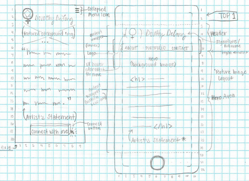
In order to make the site user-friendly, I needed to build on a solid foundation with a reliable structure, intuitive navigation and a consistent layout, all working in tandem. Organizing the site into a logical structure, I worked with concepts like visual hierarchy and content prioritization. The user’s attention should be drawn to the most important content first, information that visitors would generally be looking for when they visit.
Mobile First & Content Prioritization
The Mobile First mindset is a responsive design approach that starts with prioritizing content and then maximizing the space on the screen. To maximize space, one option would be to use a collapsed menu icon for the navigation menu. Design work starts out low fidelity, meaning the initial hand-drawn sketches contain very little detail, and are simply to organize the order of content into a basic skeleton of what the site might look like. With consideration of the goals and parameters, I could determine what information should be most prominent and what would be less emphasized.
Details and Design
Digital Wireframing & Styles
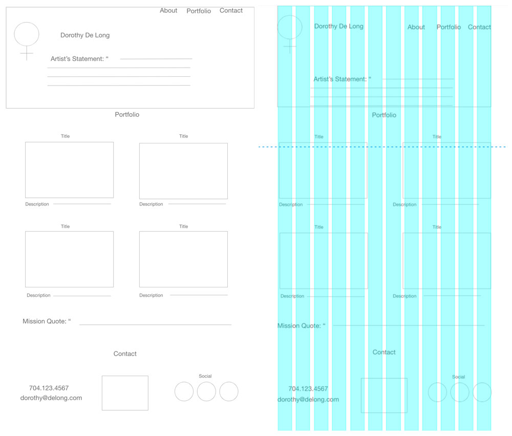
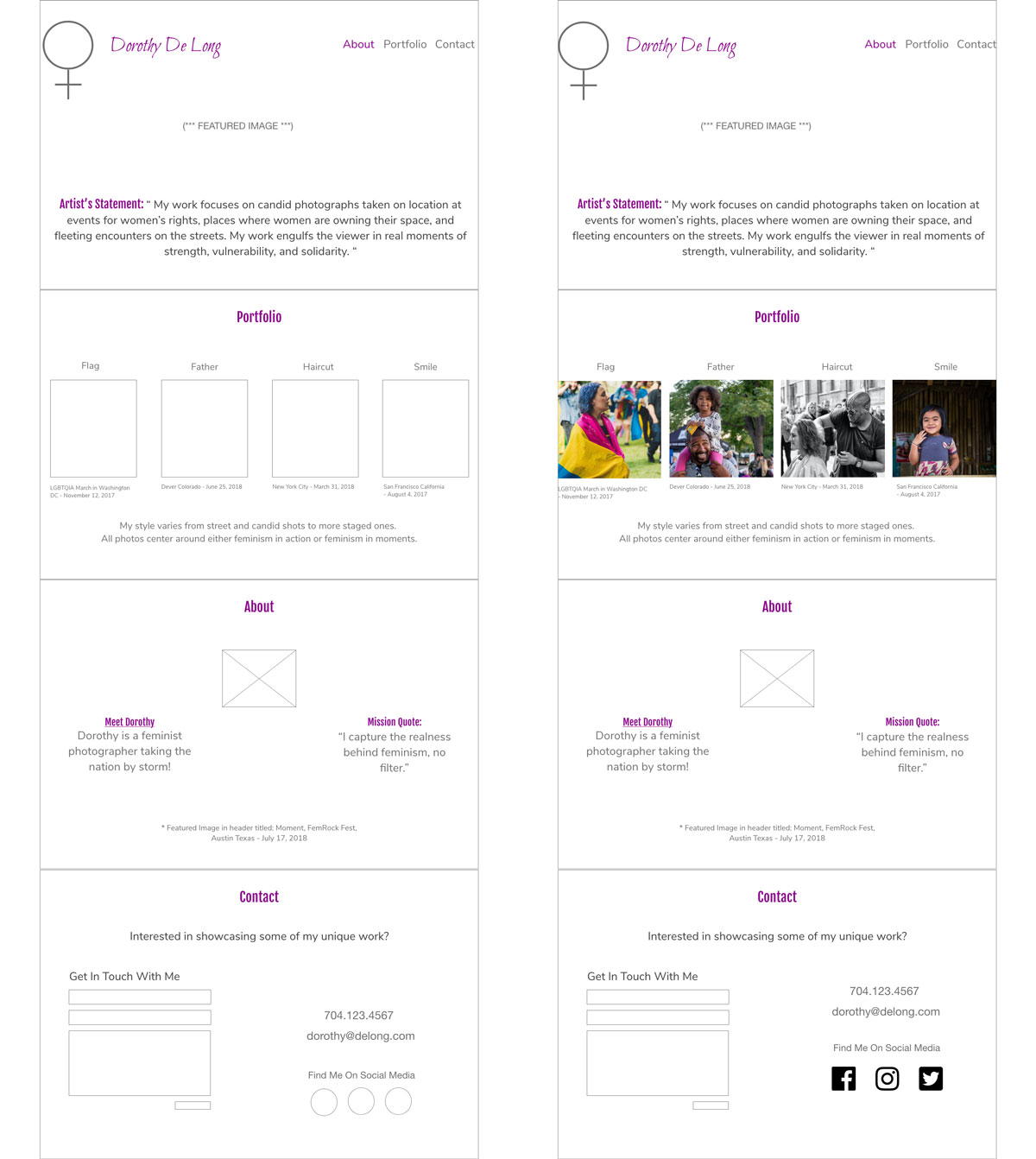
The digital wireframes began as low fidelity structures from the sketch. Using a method to help neatly align the content and elements for a visually appealing layout, I applied a twelve-column grid system to my design for positioning and alignment of content within that framework.
After examining some common design layouts, I decided to go with the Featured Image style of layout. This way, Dorothy’s work would be front and center right from the start for a compelling introduction, emphasizing her photography. I would include her logo and full name at the top for instant branding and identity, as well as her Artist’s Statement in the top header section as prioritized content about her.
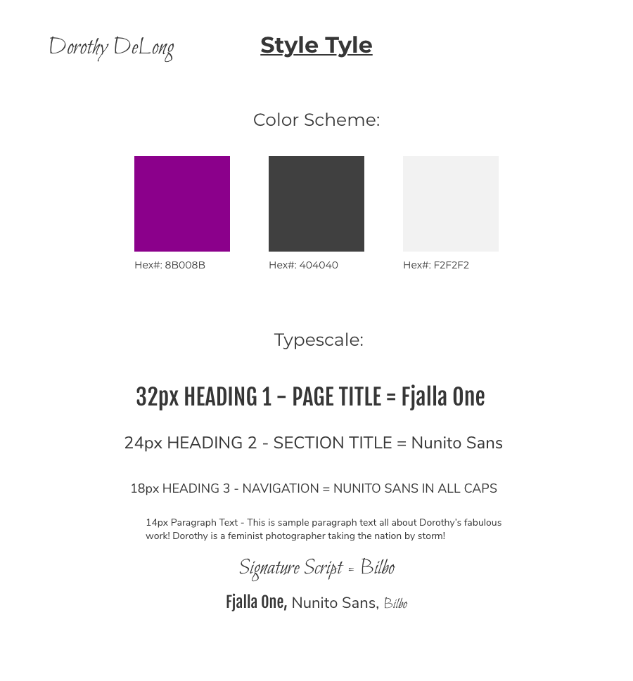
Color can be a powerful design element of the storytelling process, communicating messages, eliciting feelings, and assisting in creating visual hierarchy. After exploring color theory and various color relationships, I played with hue, saturation, and value, as well as contrast. I settled on a magenta hue for a powerful splash of boldness with a feminine edge. Outside of black and white, I stuck to a three-color scheme for this project to create visual interest and variety without becoming busy or distracting.
Next was selecting typography and using it establish visual hierarchy, ensuring it expressed tone and mood, and complemented the overall design. I experimented with different font-pairings on digital artboards before deciding on the main typefaces for Dorothy’s style tile, keeping in line with her style and goals. I created a custom typescale as a guide for all the sizes, typefaces, and transformations throughout the site.
Versions & Revisions
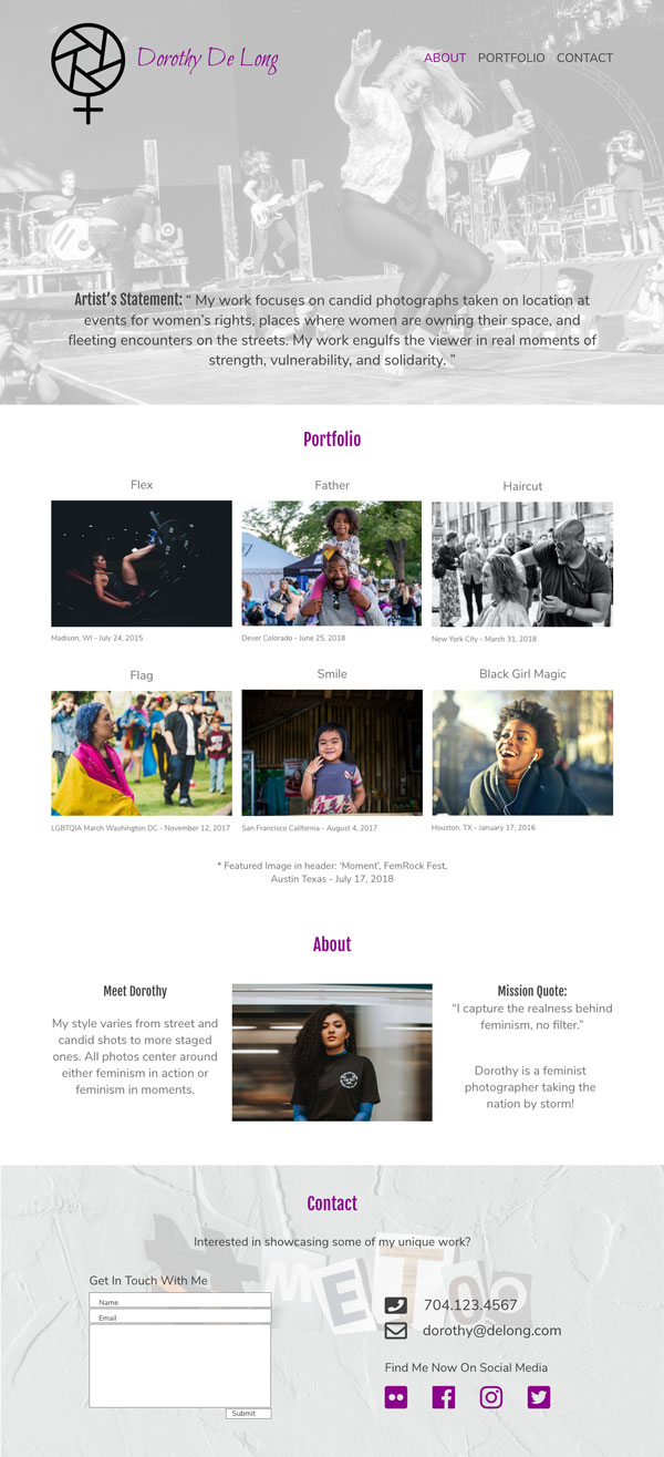
Moving from low-fidelity towards high-fidelity digital designs, means adding lots of detail for a higher-quality appearance. This includes graphics, images, colors, and typography, all working well together.
Dorothy’s profile samples had some variance and yet commonality with her own unique style and balanced blend of black and white statements juxtaposed alongside splashes of colorfully candid images. I needed to differentiate her portfolio from her competitors and to keep her parameters in mind.
UI & Intuitive Design
The content structure was designed to help users easily find what they need. Understanding design patterns and trends that help produce an intuitive user interface, a trend I used here was applying an opacity filter to the background feature image, which made the text easier to read. As an intuitive design feature, I applied magenta from the color scheme to the navigation links to imitate what Dorothy’s site will look like when a user hovers their mouse on the About navigation button.
Feedback & Iteration
So far I’ve performed research to determine site goals, brainstormed ideas, created wireframes, and built a design comp. At this stage in the iteration cycle it’s best to get feedback from others invested in the design, like the client, customer, a project stakeholder, or potential site users before launching. Then interpret the feedback for understanding, and implement any relevant changes or necessary revisions based on the feedback that aligns with the project goals.
To make sure the original objectives were met and to ensure the success of the site, I presented the project to gather information for feedback to help determine whether more iteration was needed.
Obstacles & Challenges
Aside from determining content prioritization, maximizing space for mobile versions, design decisions, and minor revisions for versioning throughout the project, there was one small challenge towards the end of the project’s iteration cycle.
Feedback requested was to add in two new images as thumbnails to the gallery, and an additional social media icon for another profile link. I used my design knowledge and skills to do a little re-structuring to incorporate these revisions into a new version and delivered again for further feedback.
File Preparation & Final Steps
Once the design comp was complete, I did a final walk through for review, ensuring all goals and parameters were met, visual messaging cohesion, and that look and feel were on point for Dorothy’s personal photography brand. Finally, in preparing files for the next steps I made sure the files and folders were properly named and structured, and that everything was well-organized and labeled.
UX Recommendations
As Dorothy’s portfolio grows she will likely continue to add new selections of work online to showcase. Either an image collage or a gallery slider like image carousel could be implemented to easily allow browsing and scrolling through her growing collection while maximizaing screen space.
