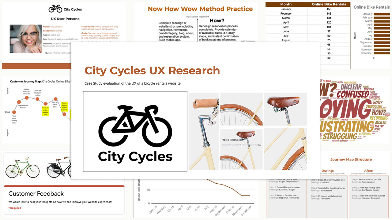
City Cycles | UX Research & Prototyping


bicycle shop owners banner

PART ONE: UX Research & Solution Ideation


Overview


A case study analysis for a professional UX research project to evaluate the UX of a bicycle rentals company website. The objective was to gather and measure different types of user data and ideate potential solutions.


My Role


Responsibilities involved collecting user data, empathizing with users to identify pain points and usability issues, comparing and analyzing results, problem-solving, design thinking, and presenting key findings.

The Customer

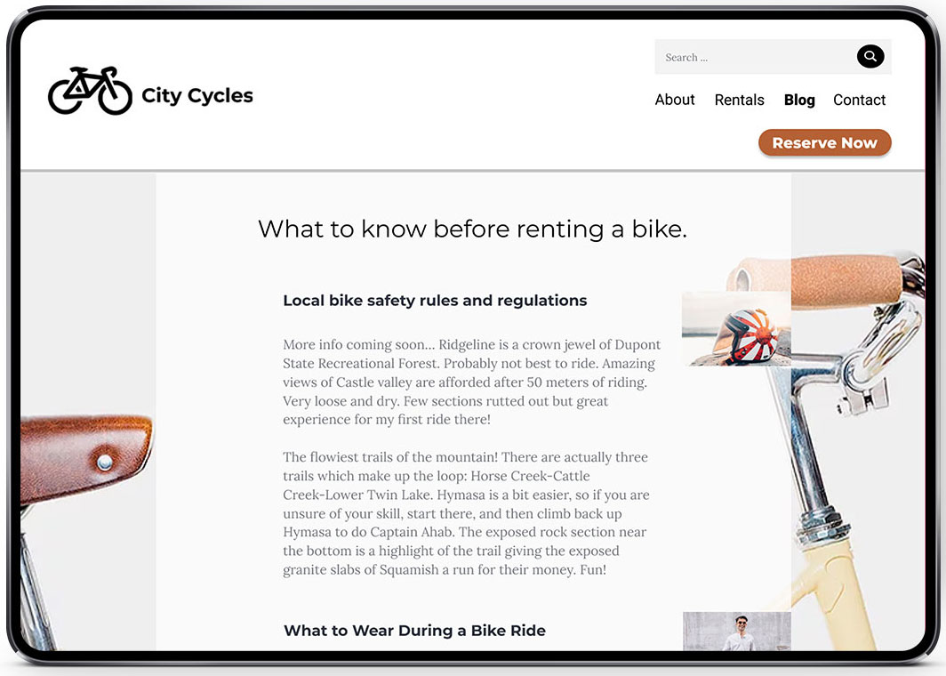
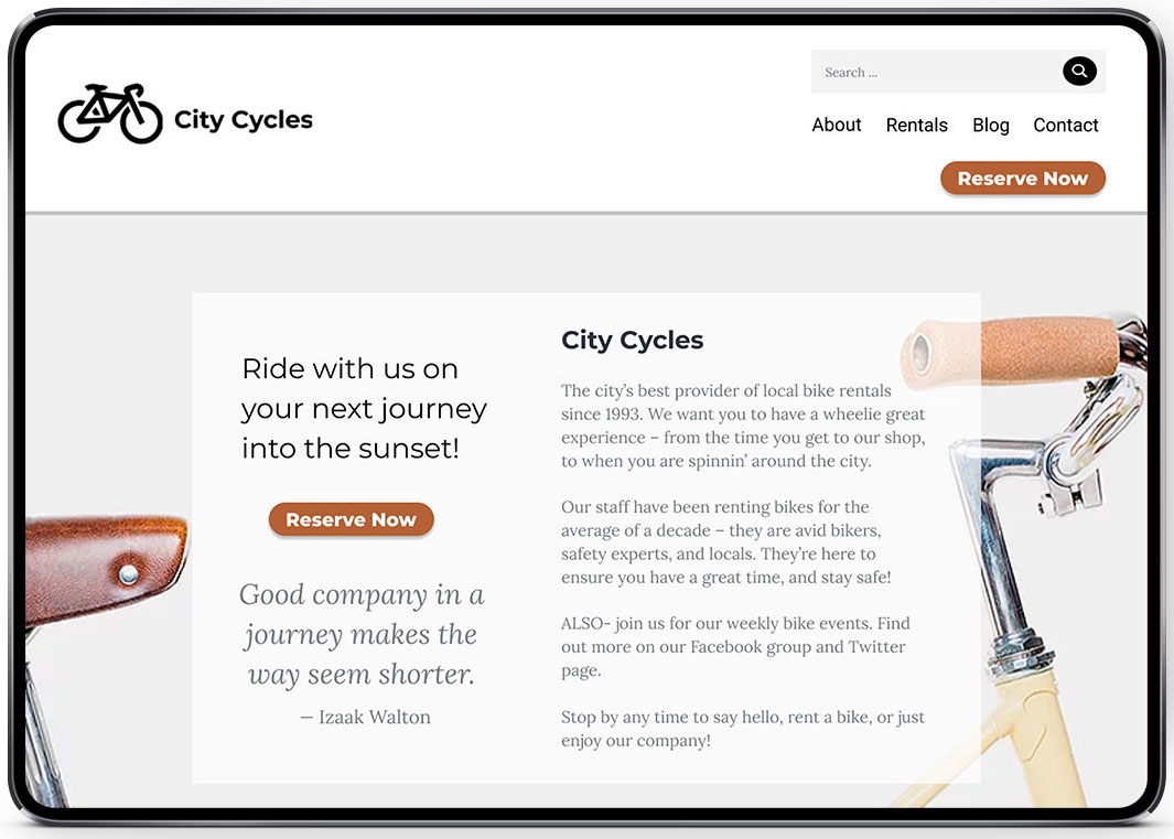
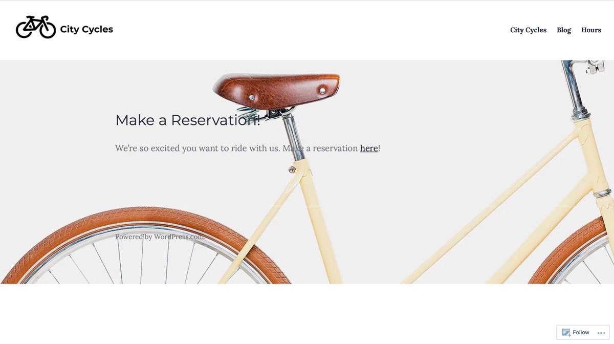
City Cycles is a bike rental shop in the downtown area of Riverside. Providing bike rentals allows customers to enjoy the experience of bike riding, reduce their carbon footprint by biking instead of driving for travel, and it provides convenience to explore the downtown area.


reservation page screenshot

The Problem


Customers don’t like to use the online reservation process on the City Cycles website and instead call in or come by the shop in-person to book their reservations. Unfortunately, this has created a high number of phone calls and drop-ins, making it difficult for City Cycles to provide quality customer service and causing an inconvenience for others who are trying to book bike rentals.

They aren’t sure why people aren’t booking online but they’d prefer more online reservations. City Cycles needed help evaluating the UX of their existing website to uncover reasons why their patrons aren’t using the website to book bike rentals.


bicycle parts collage

Defining the Problem Statement


“How might we develop a reservation process users enjoy, increasing the number of cyclists who use the City Cycles website to reserve a bicycle online?”


STRATEGY

An introduction to the history behind the field of UX, understanding its evolution, exploring the 5 Planes of UX: Strategy, Scope, Structure, Skeleton, and Surface, and an overview of data collection methods laid a foundation to formulate a comprehensive user testing plan. The 5-Step Design Thinking methodology is utilized: Empathize > Define > Ideate > Prototype > Test.


SCOPE

Planning for a successful UX research project meant selecting the required parameters for it in respect to what kind of experience the user needed, wanted, and expected. I had to identify target users and problems they might be facing, collect and analyze data through various industry standard UX research methods, and connect the data to user problems to prioritize.


inspirational bike collage
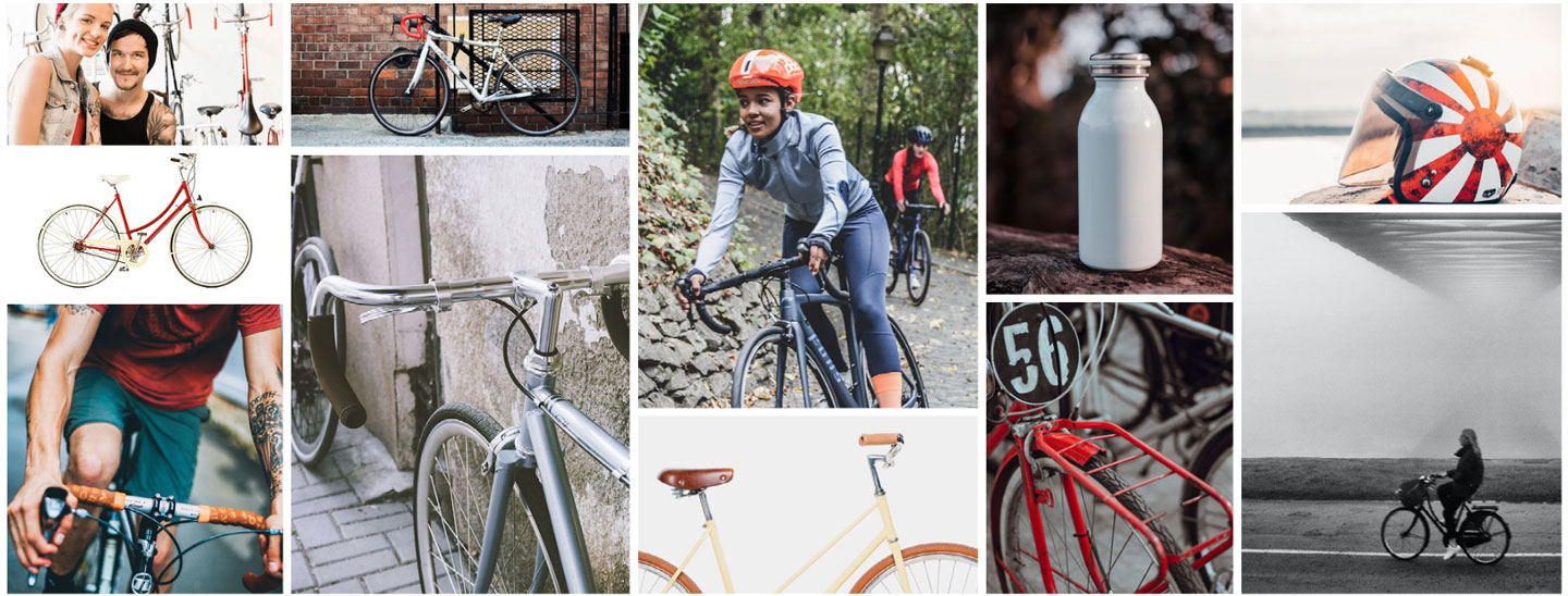
Inspirational Mood Board

The UX Research Process

Quantitative and Qualitative Research

In order to help find potential solutions to these problems for City Cycles and their users, I performed various types of UX research and data collection techniques, including user survey questionnaire creation, interpretation and review of website analytics, user interviewing and observation, data visualization, and other testing, analysis tools, and ideation methods.

The information gathered gave me insight into the users' problems and needs, and allowed me to empathize with City Cycles’ users so that I could understand their pain points in order to best advocate for their needs. 


Data Collection

  • Heatmapping
  • Journey Mapping
  • User Personas
  • User Interviews
  • Website Analytics
  • Survey Results
  • SWOT Analysis

Interpreting & Applying Data

From a combination of heatmapping data, user interviews, and website analytics data, which included: weekly traffic, regional/language demographics, site visitors, bounce rate, etc., I was able to create a valid user persona & corresponding journey map to define user pain points. To better understand the issue and to identify the client’s priorities, I also conducted SWOT & Competitive Analyses on the City Cycles' business niche.


cyclist user persona card
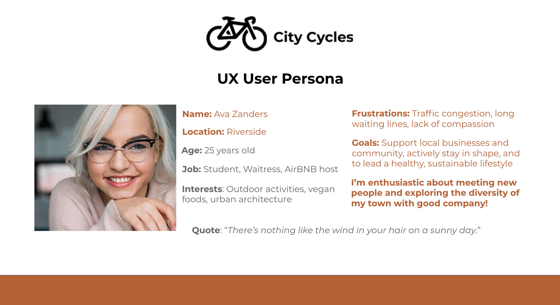
UX Data Visualization: User Persona


colorful word cloud collage

UX Data Visualization: Word Cloud


Data Visualization

Aside from charts, graphs, and maps, another common way to explain complex data at a glance is by putting it into a world cloud, visually communicating qualitative data. The word cloud displays the most common words and feelings mentioned by City Cycles users while making online reservations.

Challenges & Obstacles


Throughout the UX research process for City Cycles, I faced some challenges and obstacles. Luckily, I was able to use problem-solving skills to overcome any setbacks along the way, form a hypothesis, and continue working towards ideas and solutions.

The biggest challenge I faced while conducting UX research was identifying exactly what was preventing users from completing the reservation process through the City Cycles website and why this was preventing them from returning to the website.

I was able to overcome these challenges by using the defined problem statement as a basis for brainstorming solutions, by empathizing with the user, inductive and deductive reasoning, interpreting data, and design thinking methodology.


Design Thinking

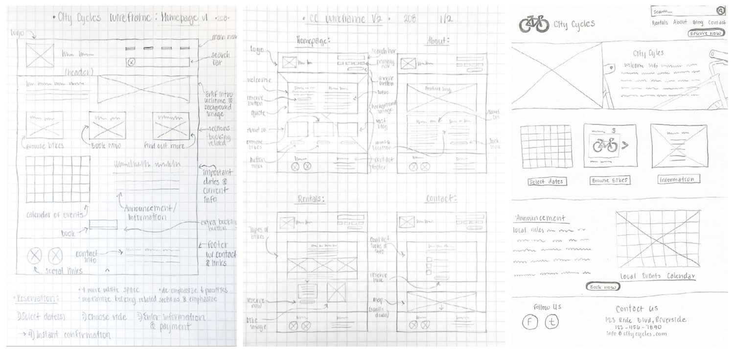
Thinking back to the original problem statement, through structured brainstorming I experimented with different methods for design ideation. I explored divergent thinking to generate ideas and solutions through rough sketches using the Matrix Method, focusing on specific subsets of the problem, then mashing up the matrix ideas to create new concepts.

After brainstorming and ideation, convergent thinking was needed to find patterns and similarities among the ideas gathered, then group the ideas based upon those trends, and finally refine and narrow my main focus. Based on the gathered user data, I had to assess what needed to change, what could be implemented, and prioritize those needs accordingly.


pencil sketch of matrix method for ideation
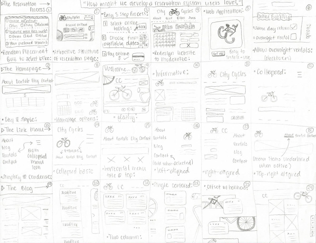
Matrix Method Sketch for Design Ideation

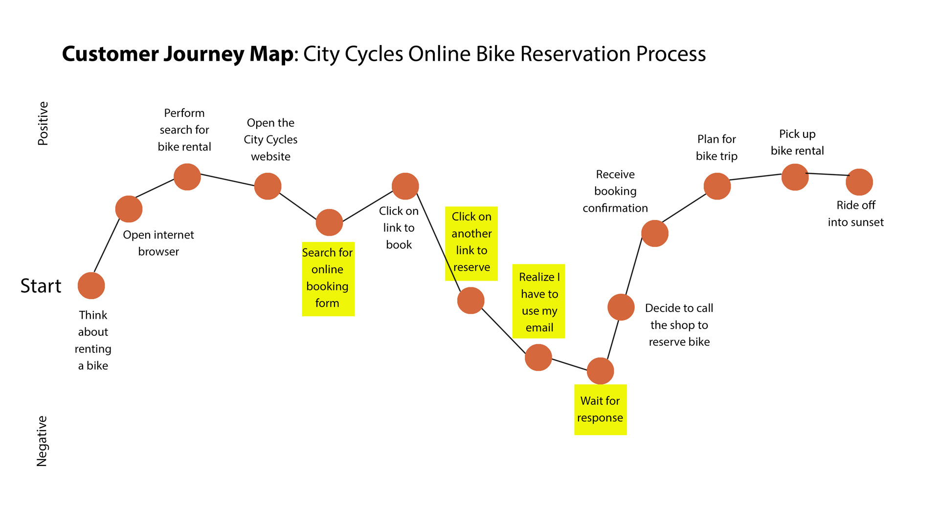
Results & Key Findings


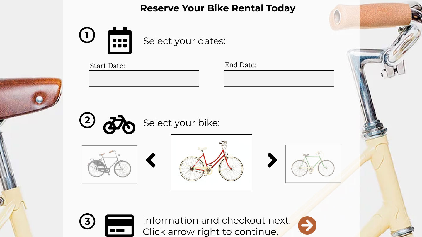
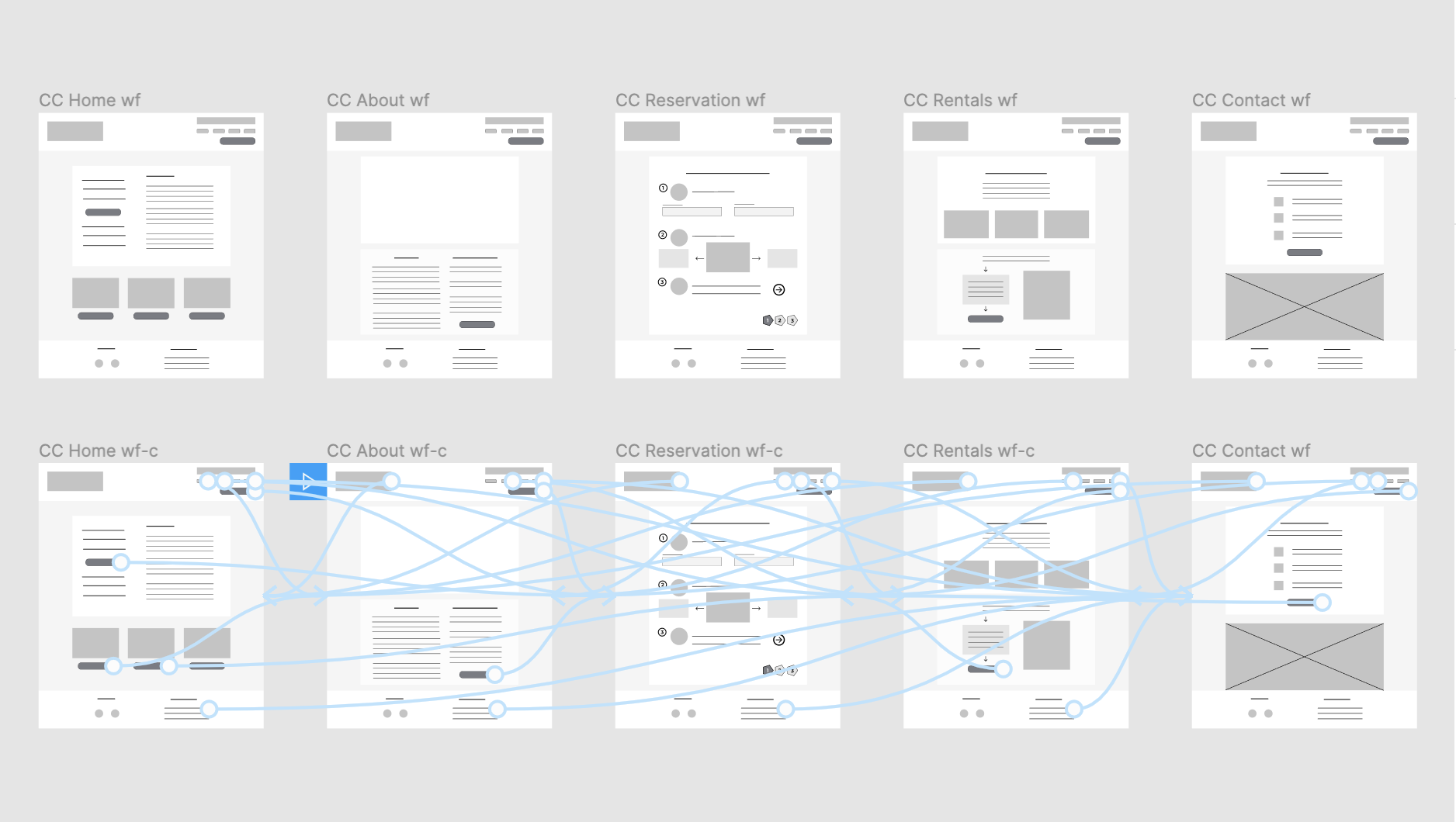
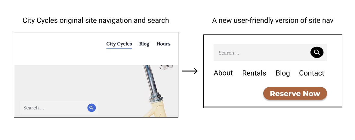
After performing research, collecting data, reviewing it for context, and analyzing the results, I found that users are frustrated with the City Cycles online reservation process and they are confused trying to navigate the site in general, witch they said was unclear. Two customers stated they always call to reserve because it’s the only real way to know they have a reservation, and another user said they felt misled. The data showed that users were relying heavily on the search bar to navigate rather than primary site navigation and the link to the phone number was the link with the highest traffic. Users overwhelmingly prefer to call in or drop by the shop, rather than struggle trying to figure out the reservation feature on the website.


City Cycles website analytics showed a consistent decrease in online bike rentals over the course of a year, and revealed that 85% of users were immediately leaving the site after clicking the “Make a Reservation” link - a much higher rate than any other page on the site. Site users expressed annoyance when their unused default email program unexpectedly opened up for a back and forth email reservation process, and closed out of it to instead call the shop.


data visualization bar chart
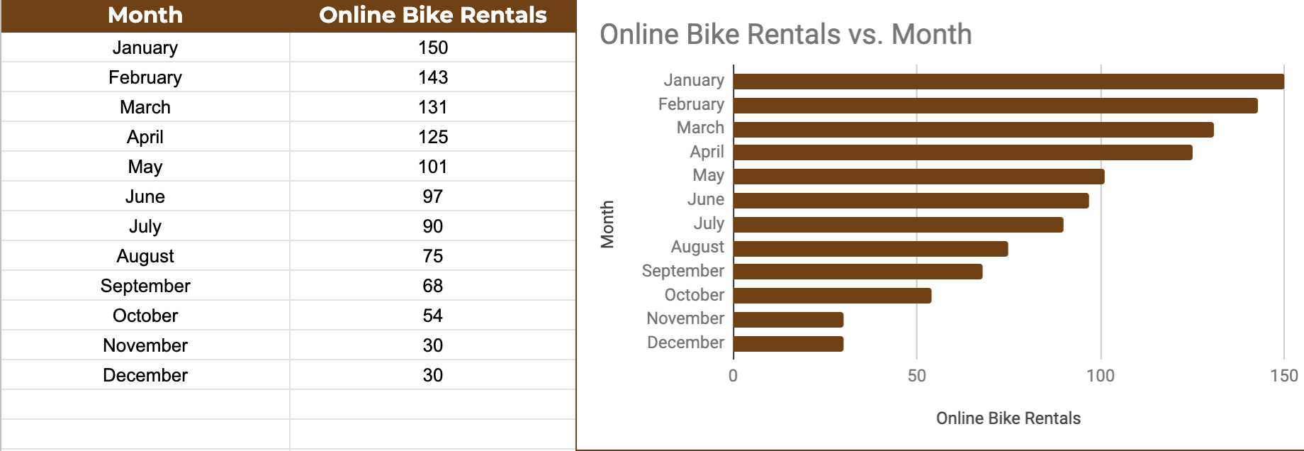
UX Data Visualization: Analytics Chart


data visualization line graph
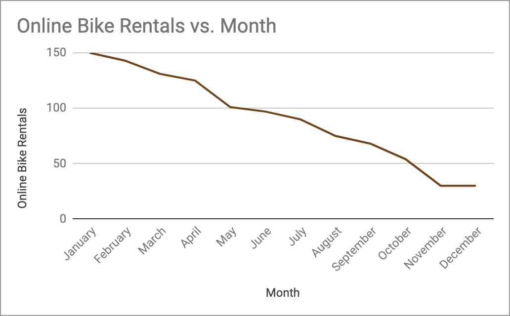
UX Data Visualization: Line Chart

Click-tracking Heatmaps Data

  • 75% of users pause their mouse over the portion of the page that contains the navigation menu.
  • 89% of users click the City Cycles logo and 80% click the search bar.
  • 60% of users click the menu links to navigate the site.
  • Only 25% of users scrolled down to view content at the bottom of longer pages, like the Blog or About Us page.

Takeaways & Discoveries


One of the most interesting takeaways from the City Cycles UX research process was that most users visiting the site are unique, first-time visitors. Data shows 74.2% are new site visitors, while 25.8% are returning visitors. Since most of them never return to the site after the first visit, a negative experience may be preventing them from returning and may be a contributing factor to City Cycles declining online reservations, and even losing potential customers to competitors.

The existing frequent users want a recurring bike reservation feature on the site so that they can reserve bikes for more than one day, and the convenience to keep them overnight so they wouldn’t have to go through the reservation process every day. They also want the ability to set up reservations online in advance and manage them that way.

Most of City Cycles users prefer bicycling because they enjoy the outdoors and are interested in exploring the downtown area, they dislike traffic-congested commutes and road construction delays, and want to reduce their carbon footprint and consider biking to be a more eco-friendly way to travel or commute.

UX Recommendations


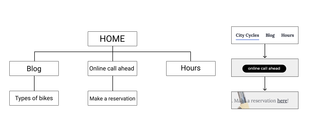
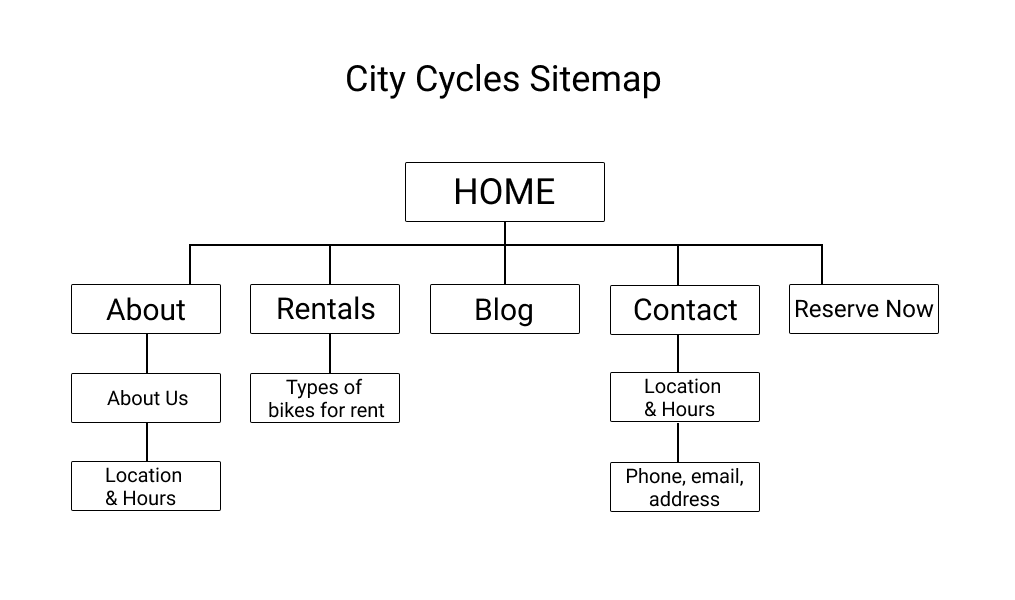
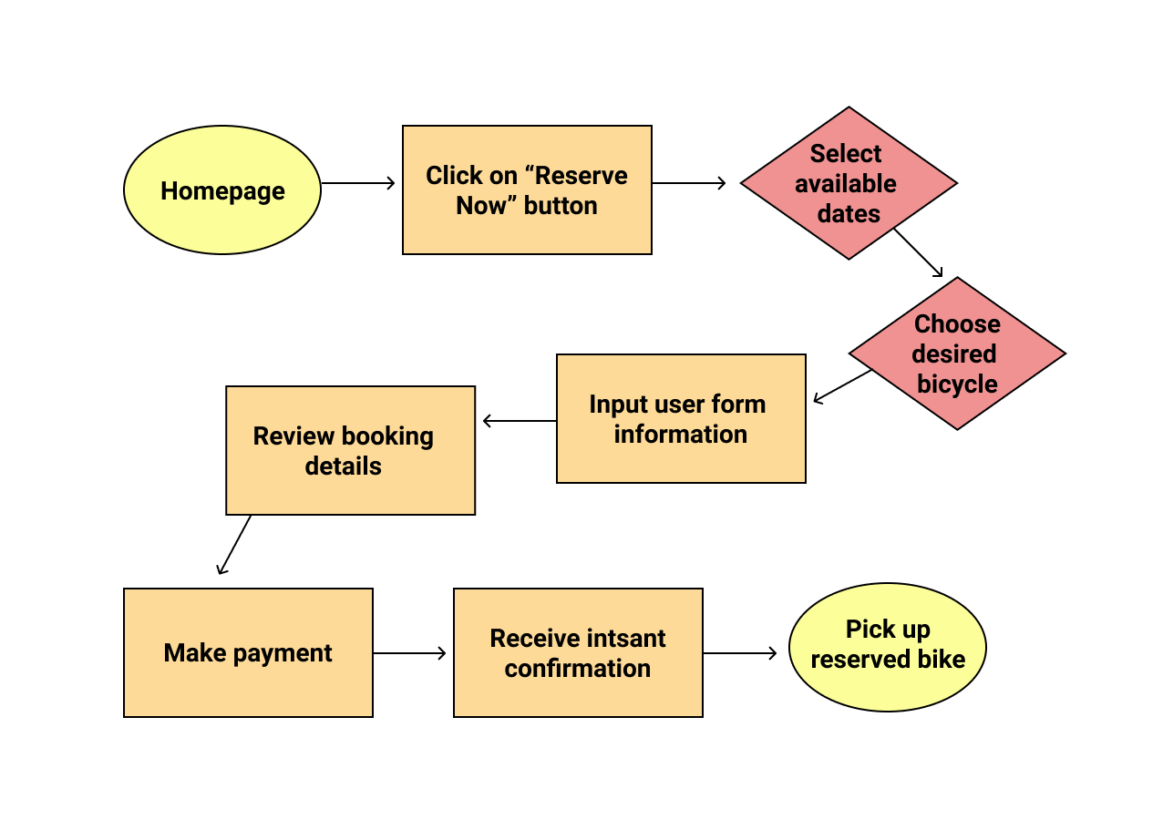
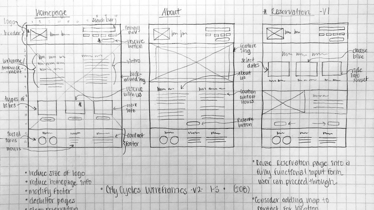
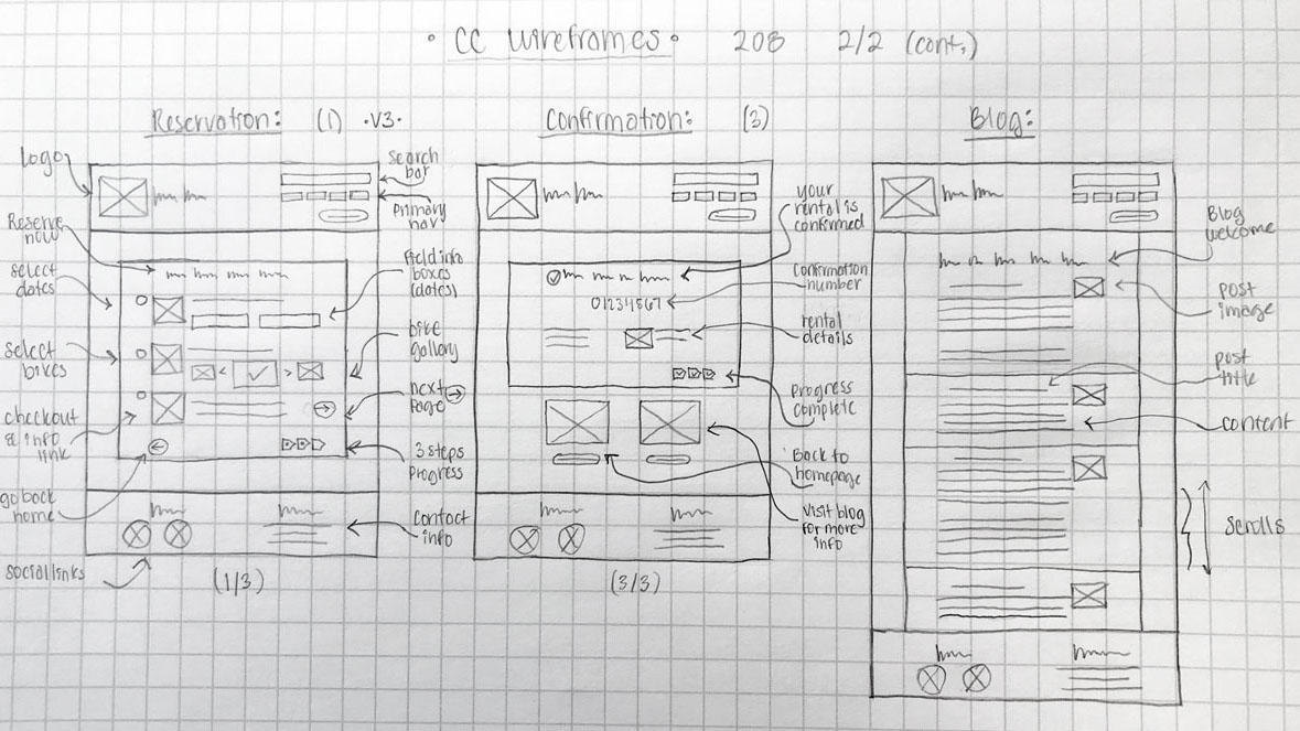
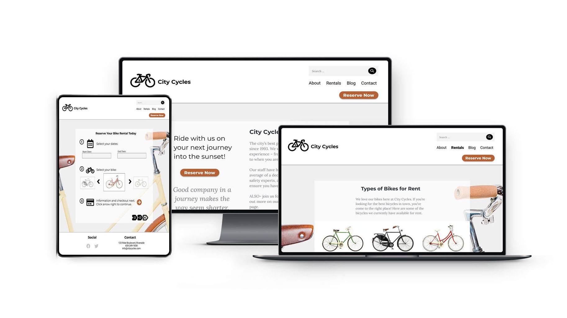
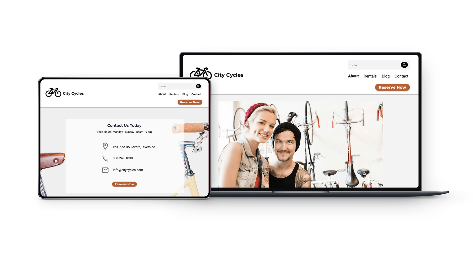
Based on the UX research data, I recommend that City Cycles modify their homepage, including the navigation menu and reservation button, to clarify their message and purpose for users visiting their site. The reservation process needs to be improved so that it’s easier to use and more efficient, offering users a positive experience, so they will opt to reserve online instead of calling in, and will even want to return as a customer. The online feature should offer convenience for the customer to obtain a bike rental.


For City Cycles Website

  • Ensure the homepage reservation button is clear and prominent on the page.
  • Redesign the navigation menu to clarify and prioritize site purpose and content.
  • Implement a simple and efficient 3 or 4 step online reservation process.
  • Provide a prompt confirmation upon completion of successful reservation.

analytics data for site visitors

PART TWO: UX Information Architecture & Prototyping


bicycle shop owners banner

Overview


UX IA and prototypes for a website feature redesign concept to improve user experience of an existing bike rentals company website. The objective is to enhance specifically the site navigation and reservation feature, making the interaction with the online process more user friendly and easier to use, ultimately increasing the online reservation rate. This is an expansion of the City Cycles UX Research Case Study.


My Role


Plan and organize site content structure in line with information architecture best practices to create a clickable, digital prototype. This involved building a new user friendly structure using universal design principles and iterative design from low fidelity wireframing and task flows based around user requirements, to high fidelity mockups and interactive prototyping, as well as further user testing and feedback.

The Problem

Rentals have been diminishing and the research suggested that the lack of online reservations and the confusing user experience was related to the inefficient website user interface and lack of user centered design within the online booking process. There was customer frustration with back and forth emailing in attempt to confirm booking, and customers were inevitably contacting or visiting the shop in person to complete the reservation process, impacting overall customer service.


bicycle shop old reservation webpage
Old webpage with vague reservation link to email

bicycle shop new reservation webpage
New webpage design with easy online process

The Solution

Redesign aspects of the website in order to clarify the purpose of the site by making the reservation button more prominent and increasing the usability of the booking feature. Design a more intuitive primary navigation that users can easily navigate throughout the site, allowing them to efficiently interact with the site features and encouraging more of them to conveniently book their reservations online.


Skills Utilized

Information Architecture

Usability & Universal Design

Wireframing

Digital Prototyping

User & A/B Split Testing

Iterative Design


Tools Used

Figma

InVision

Adobe

Slack

Google Drive


figma icon

invision icon

adobe icon

slack icon

drive icon

View the Research Presentation pdf


bicycle shop research data collage

Information Architecture

Foundation of UX

IA is the structural plan for building a user-friendly experience, organizing, labeling, and arranging site content. The method explores and guides site structures like the sitemap, navigation and labeling of the site, providing a foundation for the user experience, and is actually designed for both human users and computer search engines. I chose the classic hierarchical IA model as the boilerplate to build an improved site structure. The IA model defines the relationship between other parts of the site and informs the sitemap, starting with the homepage, then the main pages, ranked by importance and organized based on the user’s needs.


Information architecture hierarchical model diagram
Hierarchical IA Model I made in Figma

early sitemap content structure
City Cycles' current site structure

Documenting the current site content of the website gave a clear visualization of of its structure, with the goal here to show all the information on the site, how it’s organized, and how the information is presented to users. Reviewing City Cycles sitemap and their content structure revealed some of the issues inherent within it that may be causing confusion for the users.


Content Strategy

Exploring the information architecture involves helping the user understand their surroundings, find what they’re looking for, and accomplish what they intend to do. Part of this involves organizing things in intuitive ways using the process of content strategy, and creation of visual designs and prototyping solutions. UX theory, research and data determine which pages to include for the navigation, which provides the wayfinding clues for users to get around on the site.


wireframe pencil sketches
Wireframe Versions and Content Layout Sketches

Inclusive Design


Improving usability is making a quality design that is intuitive and easy for users to learn and use. Accessibility is being mindful of users with limitations or disabilities. For example, ensuring there is enough visual contrast for colorblind users. Universal design philosophy and practice takes all users into consideration from the start, including users with different levels of ability.

Clear labels help human users, screen readers, and search engines, while a clean, readable font with adequate contrast against the background and careful imagery contribute to inclusive design. After implementing universal design features, trunk testing can be performed as a strategy for determining how easy it is to use and to navigate.

Sitemap and Content Organization

Implementing the hierarchical IA model and a redesigned primary navigation would make the site user-focused, offering features like easier access to booking, a more efficient reservation process, and a more user friendly site navigation. Sitemaps show the site scope and number of pages, how the navigation links to pages and how they link to each other, and the order in which people see content. An improved nav would have a more prominent booking link that the user didn’t have to search for, and would better organize, clarify, and prioritize site content users are seeking.


I performed a card sorting exercise to discover how to best organize the content on the site in ways that are intuitive to the end user. This is where I put myself in the user’s shoes, took all the content topics City Cycles wanted to include on their website, and sorted them into main page categories in a way that made sense. There were some content topics that I placed onto the blog posts page, but I included the primary and secondary topics in the new sitemap version. I placed the social links and some basic contact information into the footer, and I relocated the reservation button to a prominent static location within the header so that it is accessible from any page on the site. Also, the City Cycles logo will link back to the home page from any of the site pages.

sitemap content structure
New and Improved Sitemap

User Flow

In the planning phase of the site design, user flows help to better grasp the options to provide the users with and to assist in delivering a product that meets their needs. They help anticipate what steps users will take so that potential problems can be caught before designing begins. The user flow is a flowchart-style visual outline of what the users see, do, and experience during a specific process while using the site, and they focus on a specific task at hand. They show the screens a user could see from one point to the next, and map out how they might get there, and the possible detours using flow chart-like elements.


user flow for bike reservation
Updated User Flow

Walking through the user flow of the existing City Cycles website, it quickly became clear there was room for improvement. Review of user interaction data confirmed this. I created a new user flow, implementing my own design ideas to improve the reservation process.

I also worked through prioritizing content for mobile first development by identifying top features to include on mobile versions, which include contact details, bicycle reservation form link, and the location and hours. With the structure in place, I was ready to progress with the design beginning with paper wireframes, to a static mockup, to a digital draft of the site, adding more detail and elements to finally a clickable prototype users can interact with like a real website.


Wireframes and Prototypes

Wireframing

Low-fidelity wireframes have a threefold focus on core UX, layout and flow features. This starts the design out as a small and simple rough idea with low detail using placeholders, then iterates through experimental versions for each page of the site.

The wireframes were then converted from paper sketch to lo-fi digital wireframes in Figma. Next, design details were added to build the prototype and a UI kit was incorporated into the user interface to help efficiently prepare elements and design patterns.


wireframe pencil sketches
Wireframe Sketches of Primary Pages

wireframe pencil sketches
Wireframe Sketches of Secondary Pages

low fidelity wireframe and task flows
Low Fidelity Wireframes and Task Flows


Design Theory


So far I’ve been using data to help qualify decisions throughout the research and design process. The collection of fundamental guidelines called design theory involves incorporating visual design elements such as line, color, value, texture, form, and space, and design principles like size, emphasis, balance, contrast and how the elements communicate to the user. Particularly here I evaluated the design of the search bar on the City Cycles website, then prescribed a potential solution using design theory.


City Cycles site users were struggling to find the search bar when they needed it and they were having difficulty using the main site navigation in general, causing a lot of confusion. Following the design principle of emphasis I decided to make the search bar, a really important link, bigger and more prominent and I also incorporated some contrast to boost the user-friendliness of this aspect of the website.

improved navigation and search structure

Design Patterns

I explored industry standard design patterns, layouts, and time-saving UX tools and decided some of the most helpful patterns for the City Cycles website would be the addition of guided steps throughout the registration process, as well as a home link to transport the user directly to the home page from the logo. Another design pattern I would recommend for the site is form feedback to complete a required component of a form, along with form hints in the fields.

Prototyping

To the low fidelity digital mockups I added styling and design elements, and began prototyping to simulate the user’s experience of the site in order to test and refine it before launching. Reviewing the user flow was a good starting point for the prototypes because it helped to visualize each page the user sees, giving an idea of what pages and visual elements needed to be included in the prototype.

For effective UX testing, the high-fidelity or “hi-fi” prototype should closely match the look and functionality of the real site, immersing users in the experience of using the site so they can provide quality feedback on it. The design platform I used to create the hi-fi interactive prototype was the industry-standard InVision digital prototyping tool. Users can interact with the clickable prototype like a real website.


View the Interactive Prototype

prototype design prototype design
prototype design
prototype design
prototype design

Advocating for UX


Implementing UX research ensures getting the solution right the first time, thereby reducing the risk and cost of failure, since testing is performed before launching a product. It’s easier to fix a prototype than it is to fix an entire custom-coded website, saving time, money, and risk to a company. UX research means standing up for your user, and backing up your recommendations with data and facts. Feedback can be implemented through iterative design improvements strategically based on user findings.


Let's Connect