Personal Website | Website Design & Development
Overview
A personal portfolio website concept and branding package using a professional design workflow process to plan the content, structure its features, and implement the UI/UX of a cohesive web design. The website look and feel was designed from sketch to final design comp with a target audience in mind using contemporary industry standard software design tools. The project covered a broad spectrum of design priciples, using aspects of web design, branding & identity design, and graphic design to create a holistic identity that travels across multiple web and print platforms.
My Role
- Plan website's goals, structure, and user experience.
- Identify the site’s ideal users, user persona creation.
- Create a personal brand and supporting look and feel.
- Design the site's user interface and design assets.
- Finalize and package a design comp for the homepage.
- Select supportive colors, typefaces, and design layout.
- Bonus: Hand code a responsive version of the website.
UX Design Process & Workflow
- Determine the main purpose and goals of the website.
- Decide who I want to reach with the website.
- Think about how I want visitors to move around the site.
- Determine the type of content I want to include.
- Plan how the content would be laid out and styled.
- Decide what colors, fonts and images I should use.
- Organize the design files to hand off for development.
Research & Planning
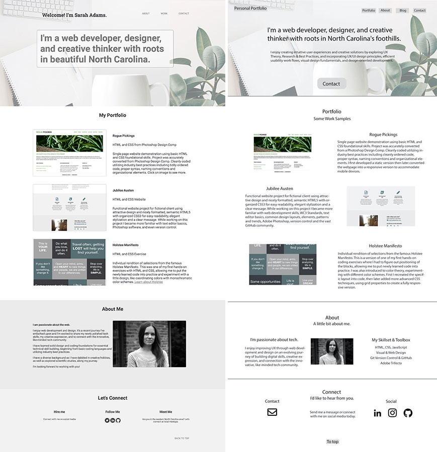
I began by researching, planning, and testing the design solutions to piece together. Brainstorming goals for the website project I asked myself questions like: What is the purpose of the site? Who are the people I really want to reach with my site? And, What are the 3 main actions I want these users to take on my site? The first step was to plan out the website’s purpose and goals and figure out what content to include. The purpose was to create a portfolio to showcase web development and design work, promote related skills, and clearly express my personality and what I have to offer.
Next was deciding what audience to connect with: individuals or employers for companies and small businesses that I find most appealing. The primary actions would be for the audience to view my work, to learn about my skills and areas of expertise, and to contact me to work with them. The main end goal is to create a design comp using visual design fundamentals & tools that will effectively communicate a unified, consistent visual message to a target audience.
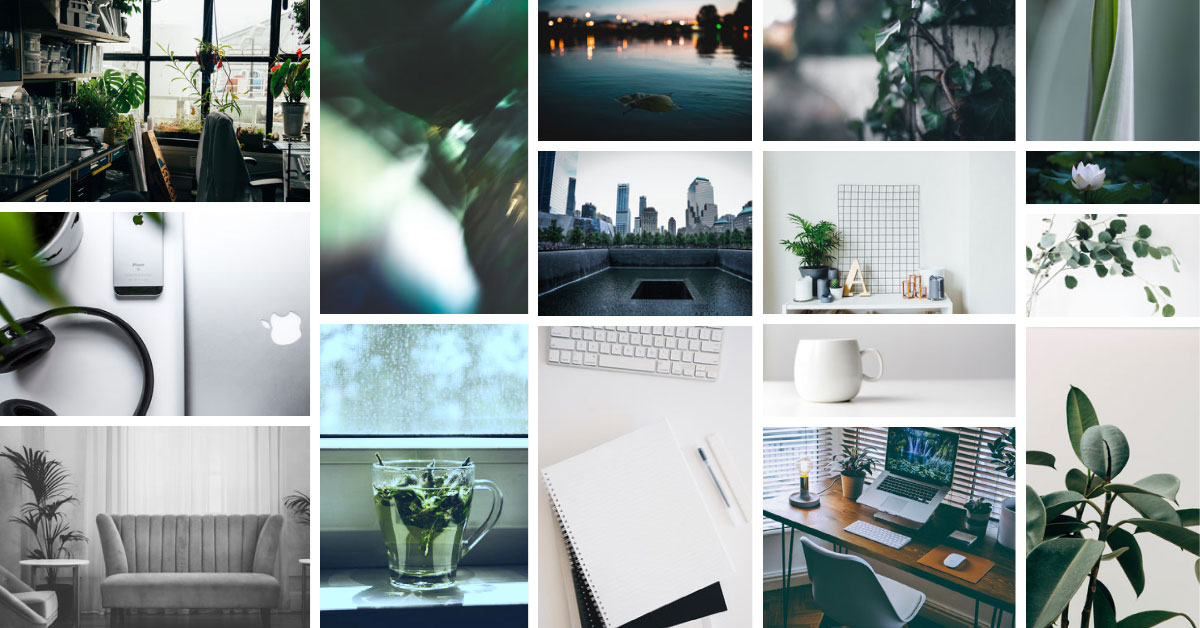
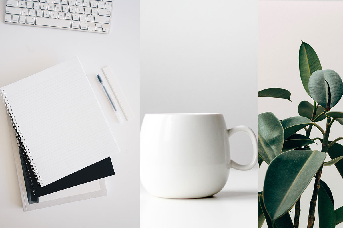
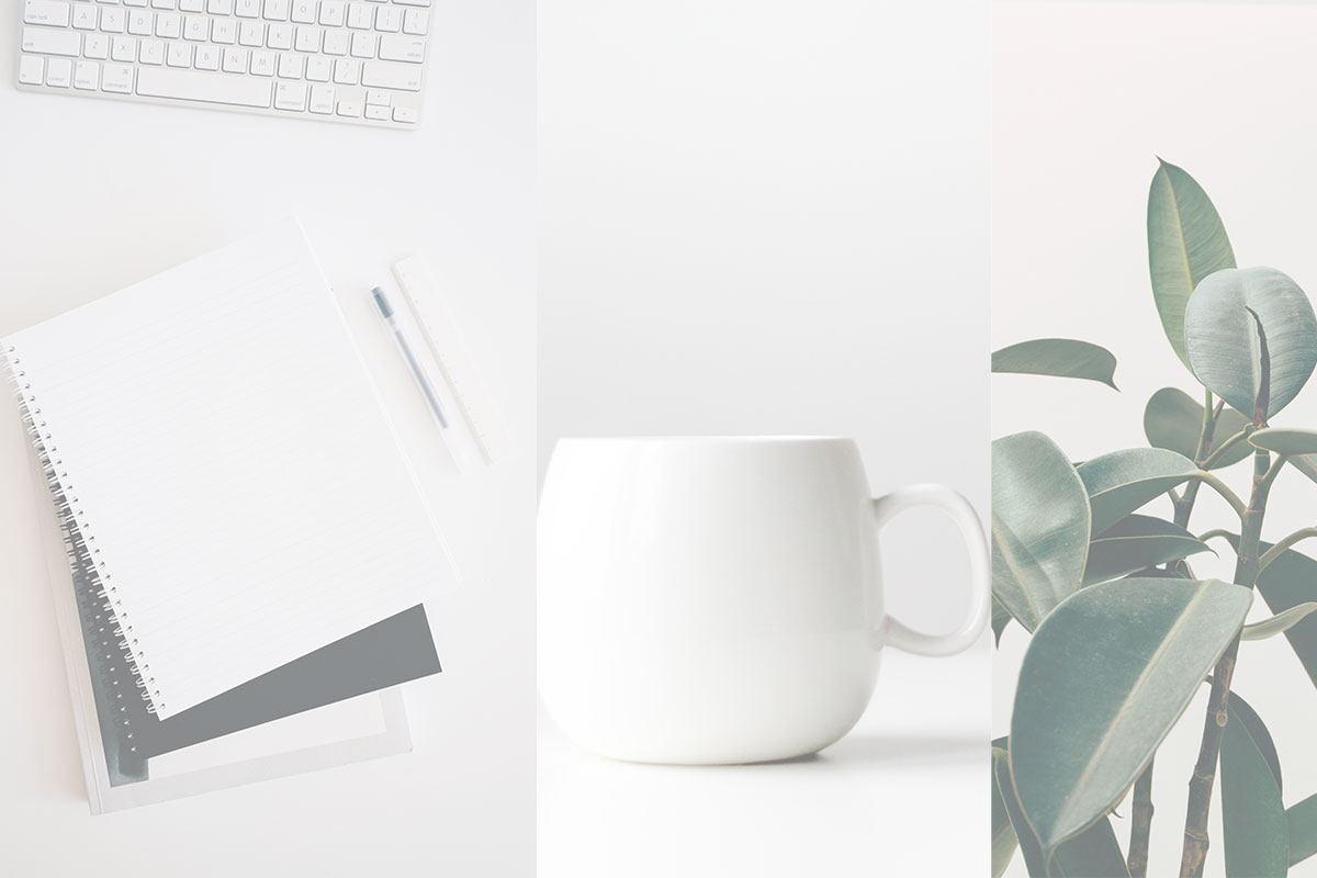
With goals in place and a better idea of the site's purpose, audience, and basic content needs, it was time to create a content structure in order to help organize the user experience. But first I created a mood board for inspiration, echoing the muted hues and calm vibe I wanted to touch on.
Inspirational Mood Board
Site Architecture & Information
Content Structure
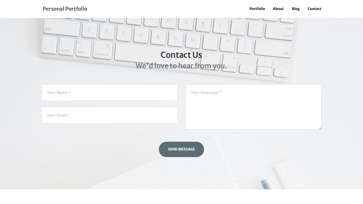
- Homepage:
- Breakdown of skillset
- Work example thumbnails
- Link to contact
- Social media links
- Work:
- Grid of work samples with descriptions
- Link to contact
- Recommendations
- About:
- Introduction
- Brief relevant story / background
- Profile photo
- Link to contact
- Contact:
- Explanation of job opportunities I’m open to
- Contact form or email link
- Social media links
Sitemap
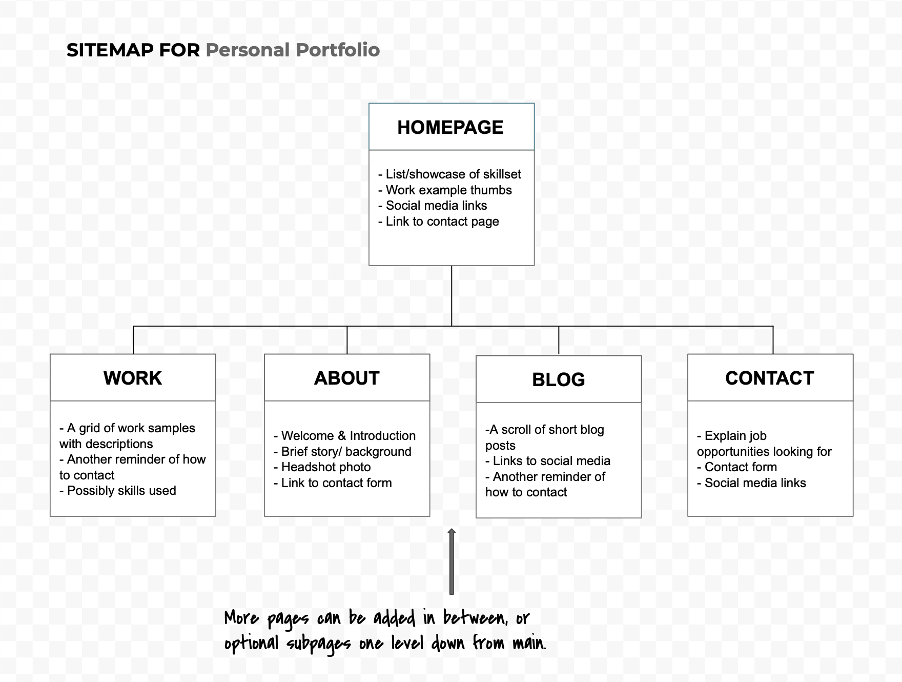
Sitemap Content Structure
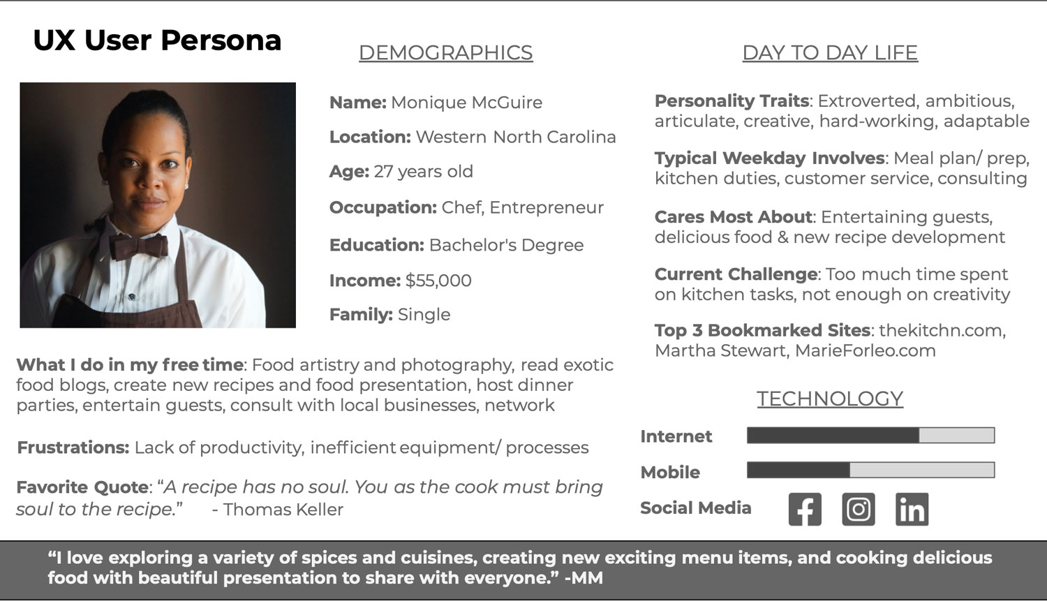
User Persona & Storyboarding
Aside from structure and aesthetics, designing a website is also about creating an immersive experience for the user to transport them to their desired destination. The main goal here is to figure out where the user wants to go, and then get them there in as few steps as possible. Creating a user persona would help figure out the specific needs and interests of target users, providing a comprehensive view of them, and a clear picture of the features needed for the site. Understanding who my users are and what their needs are, I can make sure that the site delivers on those needs.
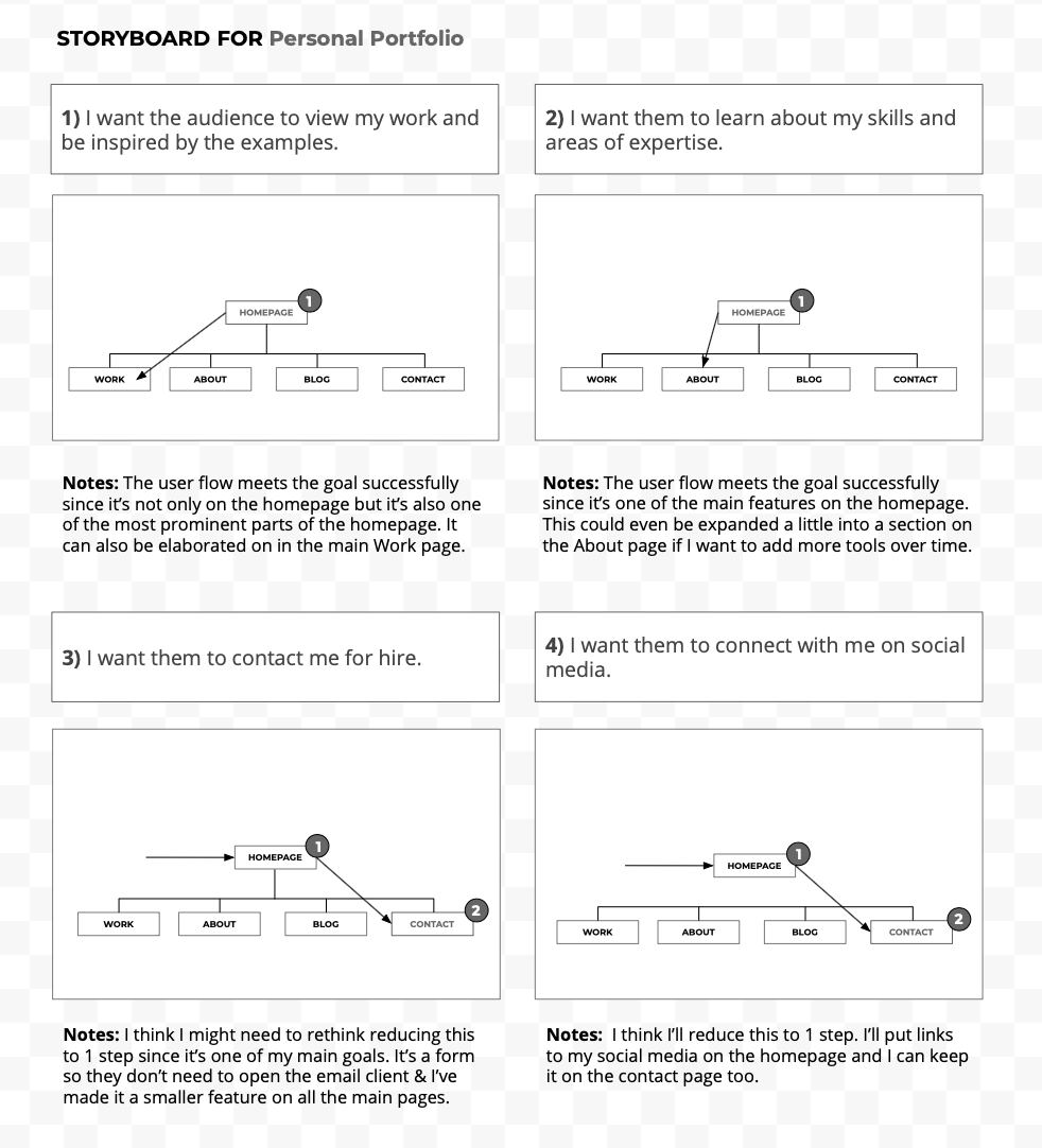
User Flow
Sitemapping organizes the site in an intuitive way, providing visual structure of sections and planning the ideal path for users to navigate so that the most important content is easily accessible. The hidden architecture of organized sitemaps ensure similar content is grouped together connecting information in the most effective way, and also improves search engine optimization, or SEO.
After mapping out the site, it was time to plan out the user flow to demonstrate the path the user would take to get from one step to the next on the website. I want the user to have a smooth and easy experience, finding exactly what they need on the site without having to click around or search for it. The user flow was sketched out in a storyboard to help visualize each step of my design concept, anticipating the steps a user would take, and to catch any problems pre-design, aligning the site structure with its goals. This step is meant to help guide the user to their destination in as few steps as possible.
Wireframing the Site Structure
Wireframes begin in low fidelity as a diagram of the basic structure of the web page showing placeholders for the essential features, content, and functionality, so basically a skeleton. The wireframe should support the UX work done so far, including the project goals, sitemap and user flow. I created paper wireframe rough sketches to use as a reference template to build a digital wireframe in Figma, and then recreated it with a higher level of detail using photoshop.
The digital wireframes began as low fidelity as well, based off of the sketch. Using a method to help neatly align the content and elements for a visually appealing layout, I applied a twelve-column grid system to my design for positioning and alignment of content within that framework. From there I began adding the content, colors and styles.
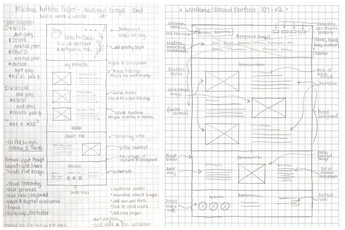
Early Wireframe Version Pencil Sketches
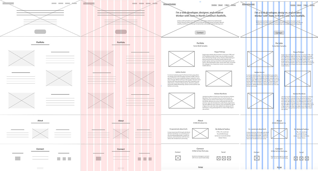
Low Fidelity Digital Wireframess
Brand Personality, Look & Feel
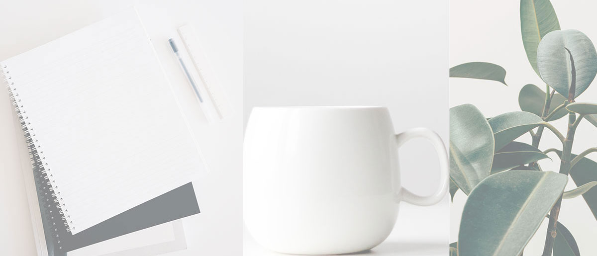
With the user experience planned, the site structure in place, and having learned about different types of design, I could now begin designing the look and feel, and brand personality. Although I intended to create a portfolio web design, I was also designing a personal brand from the ground up as part of that process. The look and feel refers to the overall aesthetic, mood, and tone of a brand. I wanted my look and feel to have a peaceful yet inviting mood with calm and soothing, muted colors, a clean professional look, and the techie vibe along with an earth element in the mix. I selected three images from my inspired collection and created a background collage for the hero header image. To tone things down I added a level of opacity.
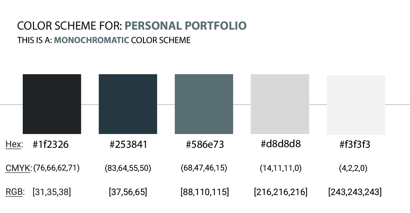
Color Scheme
Understanding color theory fundamentals and some general color concepts help prepare me to create the mood, tone, and styles I wanted. Exploring the way different colors relate to each other, or color relationships, and common color schemes, I decided on a monochromatic scheme.
For this project I was particularly drawn to one of my power colors, a teal blue-green, which I toned down a little toward a grayish hue and then added a combination of grays. I wanted the design to evoke a relaxed and trusting emotion and to communicate aspects of my personality to the audience.
Typography
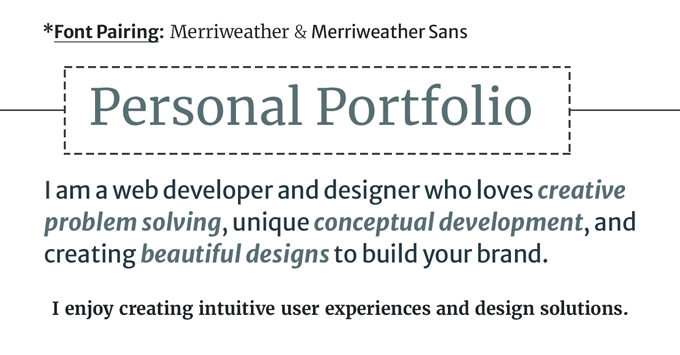
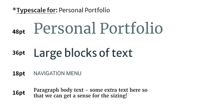
As a key component of the look and feel, I had to be selective about the typeface and fonts I chose. I played around with different font-pairings and to stick with the relaxed mood and to keep it modern I went with the pleasant sans serif font Merriweather Sans . I then mixed in its serif Merriweather version with slightly condensed letterforms to add a professional appeal to the site descriptions and to harmonize throughout the site.
Design Patterns & Trends
A set of guidelines on how to make sections of the user interface work well and look nice are found in UI design patterns. These design patterns were created to solve common user interface problems they may encounter throughout websites. To make sure users get what they need I incorporated some common design patterns, including the Home Link so that they can easily jump back home from another page by clicking the home link, and Input Prompts into the search fields to provide guidance for entering their text, without cluttering up the interface with extra instructions. For design layout and trends I went with a Full Screen Layout with the chosen imagery set in the background as an immersive full-screen display, the added opacity layer, and a splash of Big Typography for the compelling headline, although a little more subtle than some of the louder trends.
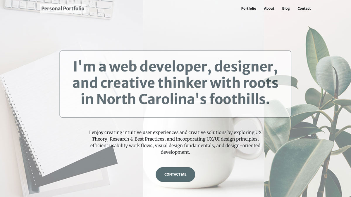
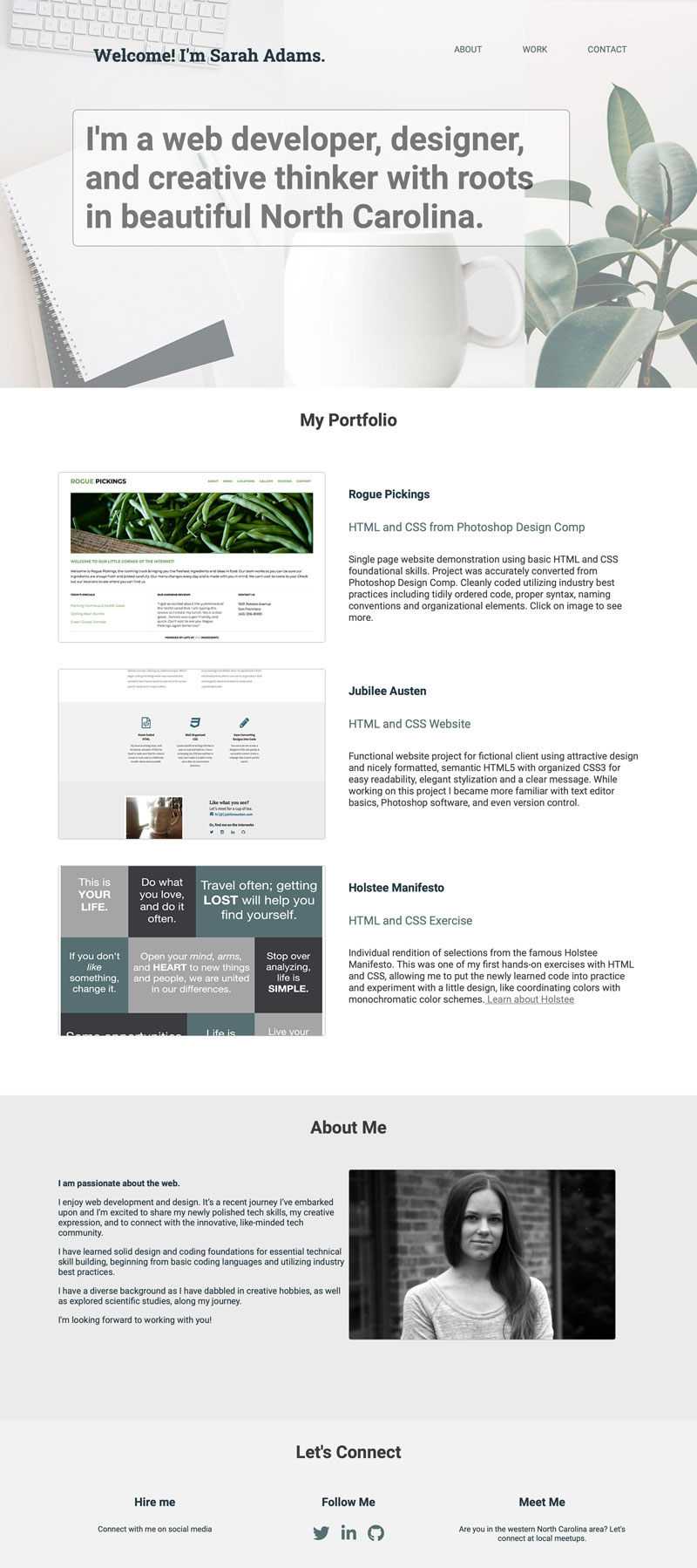
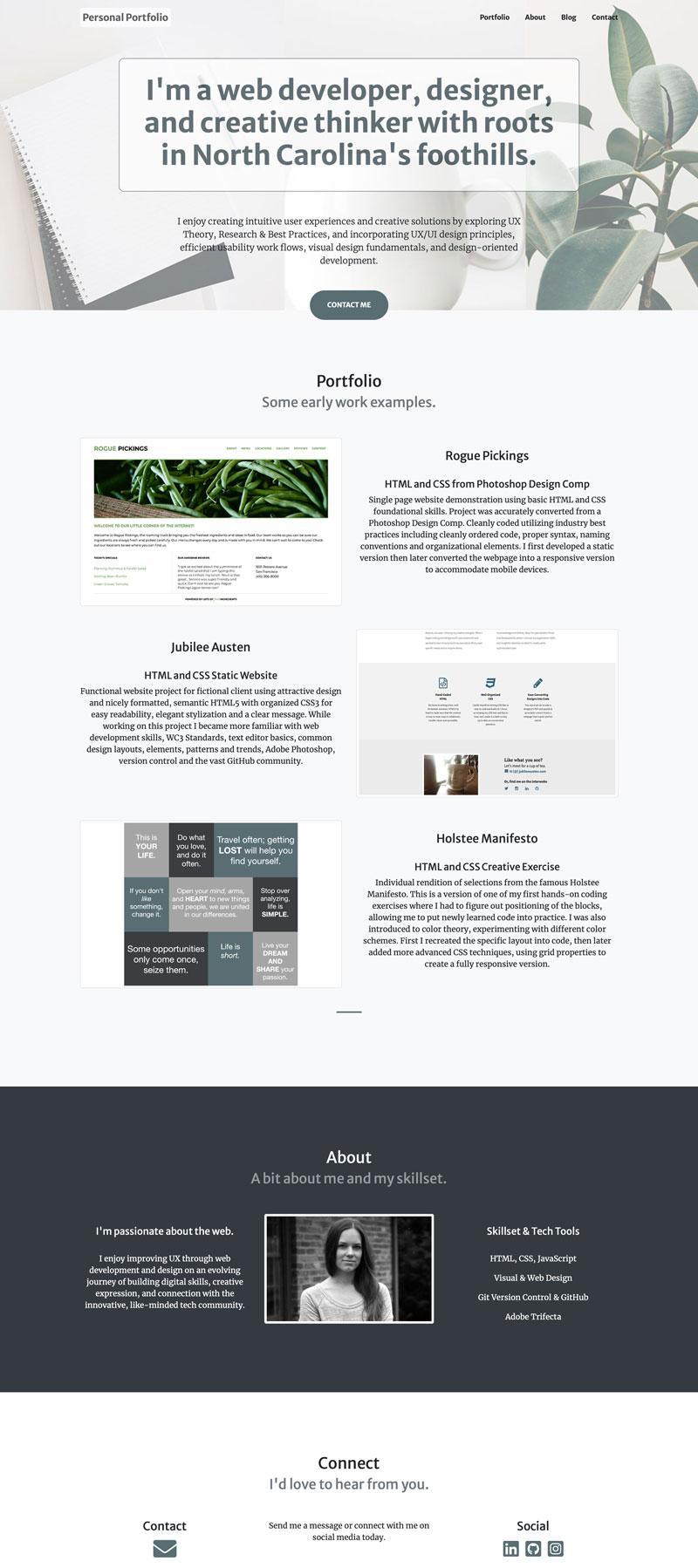
Design Comp
The digital wireframe was styled into a mockup as a design comp in Photoshop. The design went through a few versions and iterations throughout the process. Before packaging up the files, I wanted to ensure all the details were in place and everything was organized by using a final checklist:
- Is everything properly aligned?
- Are fonts the right size and weight?
- Is text spelled correctly with proper punctuation?
- Are images and graphics the right size and shape?
- Is the use of color consistent?
- Are there any competing design elements or effects?
- Is everything properly placed with plenty of white space?
- Are there any design elements or final touches missing?
- Does everything on the page need to be there?
Then I followed the steps of layer organization to finish up:
- Delete any layers that are empty, hidden, duplicates, or no longer in use.
- Name all layers in a way that makes sense to anyone that might being using the file.
- Make sure each design element has its own layer.
- Organize the layers into logical folder groups (such as navigation or images).
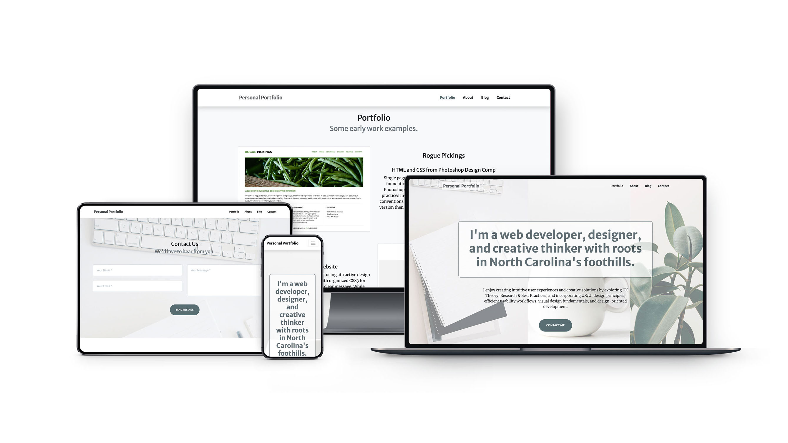
Web Development
As a bonus to exercise my developing web skills I decided to code up the design. An early version of the design was coded into a static website version as one of my first web development projects. I later learned new techniques, frameworks, tools and responsive, mobile-first web development and design, and I recreated the site into a fully responsive and mobile friendly version.